 |
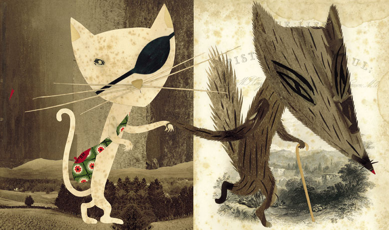
| Book spread from 'Pinocchio' |
Image from www.sarafanelli.com
Above is one of my favourite images from her website which forms a series of illustrations for a copy of the book 'Pinocchio'. I love the emphasis on leading in the piece, created by dividing the page in half and inverting the textures used on the characters and the backgrounds. I like how the backgrounds provide context and footing for the characters as well as looking quite like a collage with the characters added on top and the mix of spotted background creates a nice sketchbook look to the right hand background. Although the actual characters don't use Fanelli's distinctive cut-out human eyes, I think this is a positive here as it would have perhaps looked too creepy if these had been incorporated. Generally this is the aspect that I don't like about her work - the eyes just always grab your attention immediately, they're too provoking and leave the rest of the illustration sometimes in the background. Here though everything is in balance I think because they aren't included. With the dark colour scheme and sharp heads a really sinister atmosphere is created, which is great in contrast to the colourful piece that Fanelli also made for the book. The limited colour scheme really helps here as well as the dismissal of human eyes to show another world beyond the happy scenes of 'Pinocchio.'
 |
| Book spread from 'Pinocchio' |
Image from www.sarafanelli.com
This book spread really brings out the dark nature of the book yet it still appears story book like due to the difference in proportions of the characters. Overall, I really like this modern look at Pinocchio.
No comments:
Post a Comment