Wednesday 31 October 2012

W5 - Photography Week

I admit that to begin with I wasn't sure about Photography, as before we started the week, I thought that it was probably the area which I knew the least about. So there was some trepidation.

We started quite intensely as well by immediately having access to 35mm film cameras and learning about Large Depth of Field  (where the background and the object are in focus as only a small amount of light enters into the camera, concentrating the image) and Small Depth of Field (the background isn't in focus, but the object in the forefront is as the camera is flooded by light, so the image isn't concentrated but spread over a shorter length). We had to go around college in small groups taking portrait shots of each other against interesting backgrounds with at least one L.D.O.F and S.D.O.F image.

Initially I was a bit confused as I'd never heard of these shots before or used a 35mm camera, which was a bit stressful as you can't see how your shot has turned out until you develop it later. But as we got onto the development process, my opinion started to change. To develop the photos the film was taken and returned to us as a film strip. We then used the exposure machine to set the scale and develop the film by applying light to photographic paper for a set amount of seconds. To test how many seconds this needed to be, as it changes for each image, we first had to do small tests on sections of the image, using an increasing amount of seconds so that we could see at which time the image was under, over or developed just right. After the light was applied the paper was fed into a developing machine and after 40 seconds, we had our finished image.

The Tests

 The Final Images

Large Depth of Field

Small Depth of Field
The image above also used a contrast. This was done by editing how much of each colour was let through in the light on the exposure machine. This increased the contrast between black and white, giving a darker depth of black which helps to accentuate areas of detail on this image.

We also did some work in the studio, looking at how movement can be captured on camera. This was done by turning all of the lights off in the studio, holding the shutter down and while a person moved around, turning a light on and off every few seconds. The position that the person was in while the light was turned on appeared on the film, with all of the other positions as well, creating a progression of movement. I really liked this process as the finished image looks like a series of key frames from an animation and it captures movement well. I couldn't believe that each new position didn't cover the old one, so I was really surprised by how good the image looks.

The Tests
The first test came out over developed as I forgot to close the aperture slightly so that the paper wasn't flooded by light.
The Final Image

I used an even darker contrast on this image which I really liked as it makes the positions and transitions look quite subtle.

Although working with 35mm film was sometimes a bit scary because you couldn't see the results straight away, I actually really liked using it because of the surprise of the developed photo. As you don't know what might happen, it makes you more careful but it means that the process is more creative and you value the image a lot more.

Photo-grams

We also got to make Photo-grams, which is where you can imprint the shapes of objects onto photo paper using the exposure machine. I really enjoyed this process as all that you had to do was position objects on photo paper under the exposure machine and apply light for a few seconds. After the quite technical development process of the Depth of Field images, these were really quite easy and fun to do as you could create them quickly, which encouraged creativity and experimentation.

The first image used netting and a plastic bottle, which I liked the effect of as it showed how the different textures, details and materials can be transferred to paper. The next two images came about almost accidentally as I mistakenly picked up two pieces of photo paper that were stuck together and so the image was developed onto both pieces, creating one developed and one under developed photo-gram. I quite like the under developed one though because it looks quite old and traditional especially as all of the objects used could be from the last century. This was meant to be more conceptual as well, showing maybe a theme of development, how experimentation led to the light bulb and this led onto film, but perhaps sensibilities can hinder such developments or those in the future.

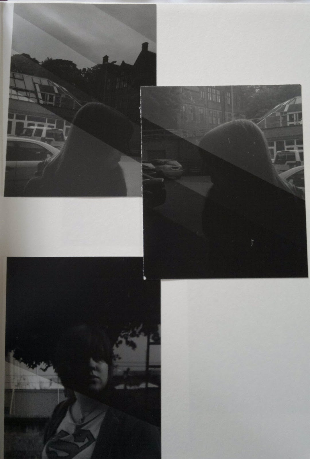
I also tried extending an image over 3 pieces of photo paper. This was done simply by exposing them all to light at the same time.


I liked this continuation as it seems to show that even if you face distractions or if the duration of your journey is long and complicated, the final goal can always be seen clearly.

Chesterfield Observations

Also this week we had the task of going into Chesterfield's town centre and taking photos, using a digital camera, of people in the Market Place. We had to focus on taking interesting photos that contained elements of colour, juxtaposition, composition, interesting interaction and detail and we had to take at least 15 good photos (so at least 50 photos to sort through later). This sounded like a lot to me, but I ended up taking around 80 because you had to be so quick, as the people weren't posing, they kept moving, that often you ended up with several bad, blurry photos before you got a good one. After getting over the initial embarrassment of taking pictures of people without their permission I quite enjoyed this process as it made you look at everything around you (more critically) and it showed me the importance of just trying, as most of my best photos came about by accident.  I was a bit disturbed by what I saw on a Market Day, but the photos were worth it. 

After downloading them to a computer the 15 images that I selected were then edited using Photoshop, where tools like hue/saturation, levels, exposure, contrasts, vibrance and photo filter were used to make the photos look more professional and to convey the message of the images more. For instance I added a blue, cool filter on a few photos to create a more melancholy mood. 

Below are the 15 photos, complied in a photo album movie.


Although I initially found Photography quite hard as it was quite technical, I've really enjoyed Photography week as it's given me a different way to look at my surroundings and how to show this in a photo.

Thursday 25 October 2012

Showroom Cinema: Celluloid Screams

As well as hosting a film season, Showroom cinema is also holding an exhibition of alternative horror film posters, created by local artists and inspired by horror films shown previously as part of the Celluloid Screams film season.

The exhibition isn't too big - it only lines the walls of the foyer as you walk in, but the works create a nice collection of different techniques and styles as well as interpretations to the horror genre. While I wasn't a fan of some of the works, in particular a poster for Eraserhead by an artist that had never seen the film but wanted to design a poster anyway based on material they had seen. The poster itself was ok, but I had a problem with him having not actually seen the film, especially as the works were fan made. A film poster should be about communicating the concept of the film in one image, but surely this is harder if you've never seen the film?! But there were quite a few that I did like, which are shown below.

Nicola Stuart
 I loved this piece by Stuart because of the use of layers, which created a great sense of depth and the emphasis on a hand made style, influenced perhaps almost solely by the film. It was really nice to hear just how much she enjoyed the animation in the film and how the film had affected her life so much that she had a connection to it.

Mute
I've never seen The Evil Dead, but I liked this poster because again the artist took what they liked about the film and transferred it to their fan poster, making it their own personal work or love letter to the film. Mute went for the "home-made, low budget" look with the 'new' thrown in as well and I think it works well, as the line drawings and the etching style lines create a simple poster, that's still graphically strong and engaging, while looking reminiscient of the 80s.

Lisa O'Hara
Unfortunately the photo of this piece isn't very good due to the glare of the window in front of it, but the focus of the image, the 'Husky' can still be seen. I haven't seen The Thing, but I loved the sketchy, modern look of this poster that's coupled with bright colours, to create an 80s feel, that I suppose juxtaposes the storyline of the film which is set in a ice station and involves lots of people getting killed. The distortion on the Husky looks great, giving it real energy and menance. Plus the artist again related this poster to her experience of the film, which was originally cut down by her Dad so that she could watch it when she was young, but she was left with a lot of questions, like what happens to the Huskies? So the prominence of the Husky in the composition ties in nicely to this.

In the exhibition I found that the most personal pieces connected not only to me but to the source material the best as you could see the passion and love that they had for that film. These pieces were quite inspirational to see, but other pieces were quite bland. It wasn't that they weren't well implemented, I think it was just that you couldn't see any part of them in their work that left me unengaged. If anything this made me think how boring a lot of promotional posters for films can be now a days, but also how even professional posters can advertise a film effectively and have to meet the approval of a client, but still be more exciting to look at and contain more of the artist's personality then some of the posters on show in this exhibition.

Overall, it was a mixed exhibition with some works that simply left me cold and others which ignited a passion to re-watch the film featured in the poster or for design. You don't need to have seen all of the films to get the posters, I certainly hadn't seen every film, but you can still appreciate the techniques and styles of the artists. I think because they were individual works by different artists, it would have been impossible to create a collection where all the works and styles appealed to me, but I really enjoyed this mini exhibition when leaving the cinema. 

Celluloid Screams: Paper Cuts - Alternative Horror Poster Art is on at the Showroom Cinema in Sheffield until the end of October.

Beasts of the Southern Wild

Yesterday I saw the film Beasts of the Southern Wild and while I had heard that it was good, I went in with not a lot of knowledge on the actual narrative. I've been trying this recently with new films at the cinema by not reading any reviews of the film until after I've seen it and I've found that although this fresh perspective can leave you a little bit confused sometimes, generally it makes me appreciate the film more as I've no great expectations from it. I read Empire magazine, but a few years ago I found that a lot of films that they recommended I didn't like and I think this was down to the hype and expectations that I would give the film after reading the review. So, this new process works a lot better for me.

But I'm digressing - back to the film.

BotSW is about a young girl, Hushpuppy, who lives with her Dad in The Bathtub, an island in Louisiana, a place of simple beauty and chaos. She's able to let her imagination run free, until the threat of a flood changes her and her sick Dad's prospects for survival in The Bathtub.

I suppose that you could say that BotSW is quite a simple tale as it focuses on the circumstances of Hushpuppy, but it's so complex in how her tale is delivered. The tone of the film and the colours change from the initial vibrance and recklessness of the community in The Bathtub, to the claustrophobic interiors of the remains of their homes during the flood, to the sterile shelter and finally the apocalyptic, empty and disjointed remnants of The Bathtub. It's all startling to take in yet there's a constant battle in your mind between the dirt that inbitis the area and the vitality of life in the people that live there vs. the emotionless, stilted life in the shelter. You question the motives behind everything: Is Hushpuppy's Dad intentionally mean because he simply doesn't care or because he wants to toughen her up so she can survive? Is the shelter, with it's clean food, beds and clothes, or even a bar really better for Hushpuppy to live in than the flooded wilds? Is everything coincidence or ordained? The slightly surreal mix with the gritty realities of life to form not a fairytale, but simply life through the eyes of a six year old where strength is part of life and danger becomes the norm. Of course the strength of the film depends on the young actress Quvenzhané Wallis to succeed and her performance can't be faulted at all. There was no point in the film that she actually behaves like a six year old as she growls ferrally, uses a blow torch nonchalantly to start the hob and fends for herself. She shows no weakness and it's amazing to watch as is a scene near the beginning of the film where The Bathtub community is celebrating with fireworks in a wood at night. It seems like only the light of the fireworks, which Hushpuppy runs around with, were used to light the scene and the bright sparks deepen the shadows of the people and the surroundings so that while areas shine brightly, others sink into darkness. It's stunning to watch and it seems to sum up some of  the upcoming themes in the film like the sacrifice of safety for beauty and energy and the perils closing in around The Bathtub community and the brightest one of them all, Hushpuppy. It's an incredible film that's earned it's hype as it's deep, stark, harsh and doesn't outstay it's welcome at 94mins as the story of Hushpuppy could go on forever - if only it did.

Wednesday 24 October 2012

Graves Gallery - Turner & the Monro Masters

Today I was able to see the Turner and the Monro Masters exhibition  which focused on watercolours by JMW Turner, Thomas Girtin, Peter De Wint and John Sell Cotman.

Although the exhibition was quite small - only half a room, the selection of watercolours was great, with all of them working together and looking cohesive even though they were by a range of artists. All of them were traditional in that they focused on landscapes, architecture or scenes at sea. I love looking at exhibitions like this one as it allows you to focus on the beauty of the image as a whole, from the composition to the painting technique and detail and the skill of the artist, rather than searching for a message and perhaps being assaulted by concepts. In a modern world of constant images and messages, it really was quite calming to look at places and compositions that the artists considered worthy and beautiful enough to be captured in watercolour. What I really liked though was that several of them seemed to inhibit a loose, working style where you could still see the pencil marks, but they still looked refined and professional. I'd never seen any watercolours where the pencil marks could be seen and so it kind of reassured me that even working artists can leave the pencil lines in, while making a beautiful image.

Below are a few of my favourite works from the exhibition.

Watering Place, Peter De Wint
What was interesting about the piece above is the composition of the tree in the centre with the cows to the side. It was unusual as you're confronted with the tree, but it works really well.
Crowland Abbey, Peter De Wint

Fountains Abbey, 1799, Thomas Girtin
I love the arches in the painting above as they maintain their form and delicacy as well as their derelict grandeur and the shadow and light only helps to accentuate them. After trying to draw arches the other week I appreciate how difficult they are to get right.

Conway Castle, 1799, Thomas Girtin

Warwick Castle, Peter De Wint

Only about half finished this allowed you to see how the painting was built up, from the pencil drawing to more completed sections.
If there were any downsides to the exhibition it's that it all seems a bit cramped and small as it's confined to half of a room between Graves' modern art section and the Andy Warhol exhibition, so it also feels out of place. It really does feel like it was just crammed in and it took me only about 20 mins to look at all of the work. I think it would have been more at home in the traditional permanent section of the gallery, with works in a similar style and time period. This can be overlooked though simply due to the quality of the exhibition - it'd definitely recommend it.
  
Turner & the Monro Masters is running at the Graves Gallery in Sheffield from Friday 7 September 2012 - Saturday 13 April 2013.

Tuesday 23 October 2012

W7 - Fashion Theory Homework

Today we got introduced to Fashion and how to describe and talk about fashion pieces. It seemed quite a different way of looking at works of art as you have to consider aspects of the design that you usually don't think about with other areas, so initially I couldn't think of how to accurately describe the pieces. However the practice that we had today I think has improved how I consider Fashion and my thoughts on the works below should be more fluent that they would have been previously.
 

Maria Blaisse
http://www.mariablaisse.com/maria/projects/Paginas/kuma_guna_files/Media/gomma%2001-35/gomma%2001-35.jpg?disposition=download
Kuma Guna, 1996
Image from http://www.mariablaisse.com/maria/projects/Paginas/kuma_guna.html#4

I really love this piece by Blaisse because when you look at it you instantly get the sense of the strong form of it. The strength in it is really tangible, which was the initial impact that I got from it. But the shape also looks quite organic, like a flower or wings because of the position and the smoothness of the material. It looks like it's an extension of the body, enveloping the person. I think this piece was made out of foam and the mold-ability of it is incredible - I didn't realise that foam could be manipulated in this way so that it can maintain a dynamic shape, showing the energy of it, while enabling different shapes to be made using it.The use of white though makes the piece look man made and quite clinical. It's a nice contrast and coupled with the organic forms it helps to promote it's fine art style as it reminded me of a modern gallery because of the use of flat white and the emphasis on abstract shapes rather than a more traditional appearance.  

http://www.mariablaisse.com/maria/projects/Paginas/kuma_guna_files/Media/gomma%2001-36/gomma%2001-36.jpg?disposition=download
Kuma Guna, 1996
 Image from http://www.mariablaisse.com/maria/projects/Paginas/kuma_guna.html#5

 The visual impact of this piece is incredibly strong - to me it was instantly engaging as the shape of it interested me and confused me in equal measure. I think it's a piece that generates discussion while looking aesthetically beautiful. The form of it is sleek and aerodynamic, with the shape accentuated by the curves of colour and the difference in height of the sections. Yet it looks more like a sculpture rather than clothes, which I think is great as it seems to solely focus on form and shape rather than practicalities. Again the material that was used is foam and it's amazing the fluid, strong but energetic shapes that Blaisse has made from what I think seems a pretty difficult and unusual material. Additionally the simple colours highlight and emphasise the curves and form, instead of distracting from the simple and bold design. The piece looks almost immoveable and rigid to wear and it interacts with the body strangely, distorting the person, not the material or shapes, yet it's for dancing which promotes it's image as a piece of fine art style fashion.

I'm not used to looking at high concept fashion pieces but I really like Blaisse's work because of the energy and form she uses in them, as well as how original and imaginative her ideas are and her mastery of what seems like an unsual material.

Peter Pilotto 

Autumn/Winter Collection 2012
Image from http://www.peterpilotto.com

 I quite like this piece because the visual impact of it is quite strong as you are immediately confronted by the almost techno appearance of the material that looks like a kaleidoscope pattern. It's visually appealing though as the lines and multiple bright colours create shape and movement in the piece while contrasting with the flat black areas to highlight the energy, but not become overwhelming. This use of colour helps to make the piece look modern, technical and sleek. The coat as well seems like a twist on a bulky parka jacket, that helps to accentuate the dramatic elements of the piece by playing with the use of curves with straight lines. I really like the shape of the bottom dress as well which cuts sharply and flares out so that it still complies with the regimental modern look but it contains some organic movement in it. I couldn't find out what material was used, but the shiny, man-made look of it goes well with the technical appearance. I think a more natural material would have conflicted with the pattern, but the material allows the curves of the jacket to be held, while keeping the simple form of the dress, which hangs down nicely so that the piece doesn't become too complicated. Everything works together well to create a piece that completely conveys a sense of modern dynamic design.


Spring/ Summer Collection 2011
Image from http://www.peterpilotto.com

I think the visual impact of this piece is amazing as when I first saw it I thought it would be made out of artificial materials and look and behave in a rigid way. But on looking closer at the piece it seems like it's actually made out of a soft material that looks stretchy and moldable - completely different. Aesthetically though the distortions of shape that the pattern alone creates looks great as aside from making it looks more interesting it also adds more energy into the piece as your attention is diverted over the dress to the different sections. I like the mix as well of tight, body clinging materials and shapes with loose fitting areas. From the piece initially looking like a slinky, it confused me with it's mix of loose fitting areas and soft material (I couldn't find out exactly what material was used), which I find really interesting, especially as the lines and pattern mess with your vision slightly. But the contrasting simple colours of grey and white make sure that the piece isn't overwhelming to look at, while it still generates a more man-made artificial appearance.Overall, it's a distorting piece that seems to promote the style of artificial mixed with organic, of the free with the constricting.

I do quite like Pilotto's work, but compared to Blaisse's, whose work seems completely concerned with form and energy rather than practicality, Pilotto's work seems almost too safe. I love how Blaisse's work can evolve in front of your eyes and change constantly, rather than remaining static and confined in it's original shape - it's really inventive.

Saturday 20 October 2012

Life Drawing (6) - Colour

In this session we learnt about using various colours to create a figure by matching a colour to a skin tone and by focusing on the light and the colours this created or could be shown by. This involved gathering a range of colours and using them one at a time to build up the definition of the form by using a basic outline and shading. 

At first I didn't really like this technique as I wasn't exactly sure how we were supposed to use the colours, like whether we should draw an outline or just build them up from the shading like the tonal drawings. So my first sketch has a lot of problems, the biggest being that it isn't in proportion at all and that I don't think the colours are different enough to create much form.

 I started to get used to using the colours though, working with the contrasts and focusing on shadows and light on the body. So after this initial challenge I think the drawings improved as I practiced the technique.


Quick sketchbook drawing
 Overall, I think the effect of this technique is interesting because of the mix of colours and it encourages a bit of a loose working style as you don't have to focus on the detail of the figure, but to begin with I wasn't much of a fan. As I got used to it though the colours actually helped to create a good sense of form and because we were shading with one colour at a time it forced you to not pick out the details too early.

Life Drawing (5) - Clay

I was quite excited when I heard that we were making a clay figure and a clay head this week as I enjoyed using clay through secondary school, but I'd never used clay for life drawing, so I was looking forward to finding out how different it might be.

We used terracotta clay, which I'd only tried for the first time in W2 for Applied Arts, but I liked the consistency of it. I'm used to using krank clay, which is quite grainy, so I liked the change of using a smooth clay and because we weren't firing the clay we didn't have to worry about trapping air bubbles and the thickness of the clay so we could make a solid figure, which was definitely easier.

First we looked at making a reclining figure. This meant making a basic armature and then building up the figure by moving around the model after set intervals. It was strange switching my life drawing thinking process from 2D to 3D and having to consider how it would look from every angle, but I really loved working with clay. As we only had a set time at each position around the model it encouraged you to work quickly, so the figure had energy and form because of the rough application of clay, which I think actually has a nice textured look to it - it reminded me of claymation at stages.


Next we undertook the clay head. I'd made a few before, but these had been over several weeks, using the coil method and photos and so had been pretty hard to manage as the clay would start to dry out or sink under the weight. Luckily the process for this head was easier as we attached a newspaper ball to the top of a stand to mold the head around.

The stand with the top covered in newspaper

We used the stand by covering the newspaper, which forms the dome of the head so that the stand doesn't poke through the top, in clay. Then we built up the basic form of the face like the chin and shape of the head before building up the features in a similar way to the form of the reclining figure - of having a set time to focus on one view of the model before she moved, of working quite quickly to create the basic form. As this process continued the head changed from a generic head to one that started to take on the look of the model.  I didn't get to finish the head, but I really loved working on it. It was sometimes a bit difficult as all you wanted to do was make the face, but you had to wait for the model to turn around again. It was really rewarding though to see it build up and start to resemble the model and because you had to think in 3D it gave me a better sense of how the face is constructed and the forms of it, which should help with my observational work. Plus not having to worry about it exploding in the kilm was a positive as well. 


The head in progress:


The head at the end of the session:


The ear on this side is a bit too far back


As we weren't firing the heads at the end of the session we had to destroy them, which I found a bit hard as I really enjoyed making my head. But as I pulled it off the stand the newspaper started to look like a brain and then the face started to remind me of one of the damaged robots in the film AI during the Flesh Fair scene, which was a bit disturbing and it made me feel a bit sad, but it was interesting. It was the same process of trying to imitate life, of actively making and then destroying - I've never really had to do this with my art before, there's always been an optimism that whatever we made at school would be finished and that we would keep it forever. Maybe I just got too attached to my head as other people were happy to destroy theirs.

Deconstructing the head:


Having worked with clay before I'd thought that I'd be almost desensitised to using it, but I loved working with it again and learning how to use it for the different purpose of life drawing as well as using a different kind of clay. I'd really like to use clay in life drawing again.

Life Drawing (4) - Tones

In this session we did something completely different to the other sessions and focused on tonal drawings, which meant disregarding outlines and instead building up a figure through shading. My first sketchbook drawing though still has some of an outline because the light, which was moved around the room during the session, was shining almost directly onto the model. 
First quick sketchbook drawing
I found this a problem with the tonal drawings - that in areas where there wasn't a lot of shadow, it meant that there consequently wasn't a lot of definition as well. Despite this once we moved onto the larger sheets of paper I really enjoyed it looked as if you created a figure out of nothing. Also the figure seemed to be easier to get into proportion because you could use the shadows as markers for sections of the body so I didn't have to think as consciously about getting everything into proportion.


 Below was the last drawing that we did that we spent 2 hours on and required us to first prep a charcoal background to work on top of by removing sections with a (putty) rubber and adding shadows/ definition with more charcoal. I really liked the effect of this with the reversed contrast of colours, although it was quite difficult to do as you had to be quite precise because you couldn't rub out any mistakes. This meant that although we had a lot of time, the process was quite slow and so the figure doesn't contain a lot of detail.


I would have liked to go darker with my shading though in a few drawings to experiment with the different tones that you can achieve with charcoal, so if I get a chance to do tonal work again I think I'd try to do this to see how it affects the definition.

Life Drawing (3) - Complex Poses

In this session we changed from standing positions, which we had done almost solely since we started as these are easier to draw, to reclining poses. I really liked this change as it offered variety and a chance to see the body in different positions and how this affects it. When drawing we carried on using the technique that we learnt in the last session, where we first sketched the figure out using lines and then added the curves in later. Combining this technique and the different poses meant I really enjoyed this session and I think these are my favourite drawings so far as although you couldn't use the head as a reference point, it consequently made you focus on other parts of the figure that you could see. Plus the poses were so dynamic that I think they gave my drawings some energy that I hadn't got with the standing poses.


Sketchbook Sketch (1)
Sketchbook Sketch (2)
I also did this sketchbook drawing (below), which makes me laugh a little bit when I see it now as for it we could take a seat around the model, instead of standing like we had done before. But we ran out of stools, so I was given a box to sit on which was awkwardly positioned right next to the model. Just being so close when everyone else was sat so far away and the position which reminded me of the 'Draw me like one of your French girls, Jack' scene from Titanic meant that I couldn't help but smile for the first few seconds when we started drawing.