Thursday 29 November 2012

ABC: Printmaking (1)

This first session was focused on just getting used to using the printmaking equipment and experimenting with different shapes and colours.

I'd enjoyed trying mono-printing in Textiles and I love the look of screen printing as it's flat, solid colours are always so distinctive, so I was looking forward to doing more printing.

We started with printing using packaging, which was quite interesting as it made you look at the shape of the items more closely. We made large collections of prints in groups, trying to get as many prints as possible on a page with a mix of colours to get a good composition.

Below is a print that I did using the same process, except overlapping the prints to use more of the space.


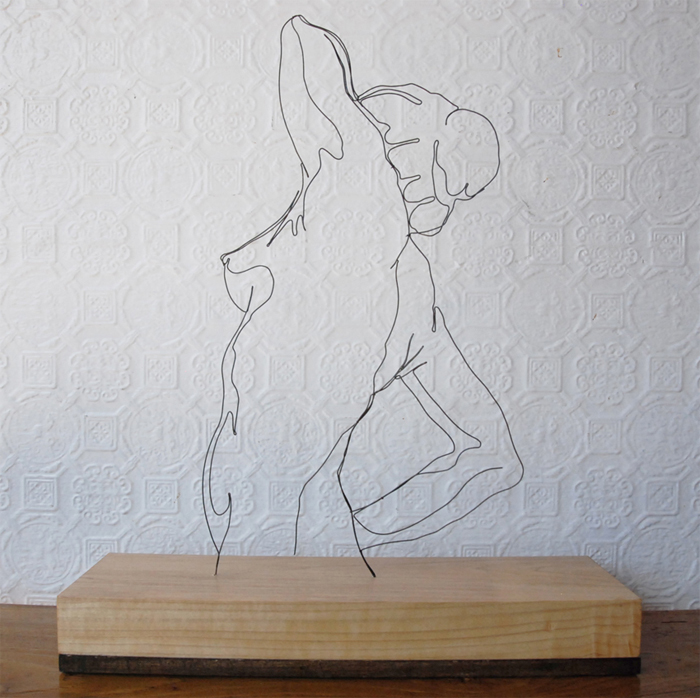
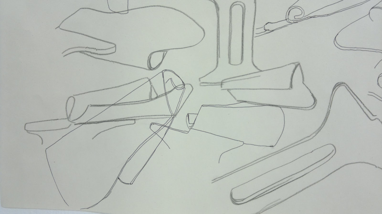
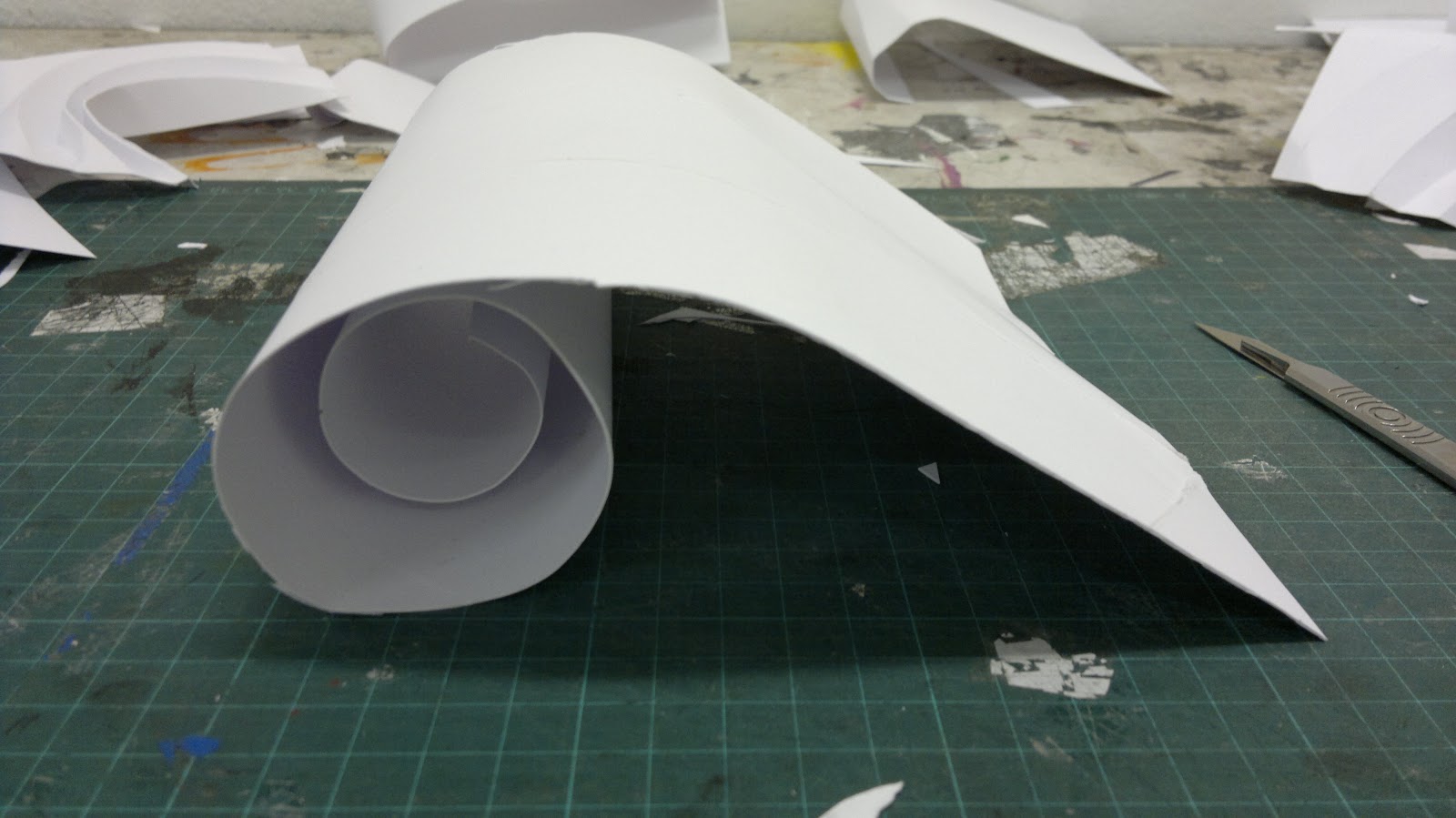
I really like the different textures created from the great solid colour to the fainter purple shape. While working with packaging was a nice introduction to printing using a press/ roller, as it was group work it didn't leave a lot of room for experimentation or creativity, so I was glad when we moved onto making our own pieces, inspired by shapes from the observational drawings that we'd done previously.


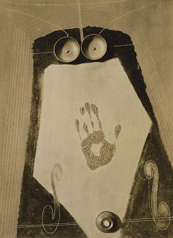
This image used the shape of a hand and I really do love the solid, flat colour. The layers came out well here, overlapping but not obtrusively so that the colours don't merge into one horrible colour. Using the thread gave an interesting effect - I didn't think that the line would be as thick, but combined with the flat colour it stops the piece looking too flat.


This image was more experimental with the stencils. I had wanted to match the blue and orange shapes up perfectly to create a really controlled image, but this wasn't really the aim of the day, it was more about figuring out what printmaking could do. Although it turned better than it probably would have had it been controlled, as the overlaps of blue and orange distort the layers, so that you can't be sure which layer was applied first, which I really like.


Again an experimental print as I wanted to see the effect that using once printed stencils would have. It was useful to see how weak the ink became, but compared to the freshly inked shape of the nose, they aren't nearly as powerful in terms of immediate appearance.


An effect of the printing process as the ink on the other sides of the stencils printed onto the paper on top. I like how the excess prints or mistakes can be used as well as the initial prints - nothing's wasted in printing.

I had a good introduction to printing with this session, but I would have liked more time to experiment with the shapes and do individual work. I tried to control the printing process and plan it out, especially as the reverse printing initially confused me, but I think that it would have been better to just experiment with the stencils and processes, as this often created the more interesting results that I could learn from.

Wednesday 28 November 2012

Illustration: Taking Line For A Walk

Taking Line For A Walk was a day long project about observational line drawings, so it was quite loose, focusing us on getting to observe the shape of faces rather than worry about tone. I enjoyed this as by the end of the day I really was just looking at the main shapes to clearly convey a face, working slowly to observe the shapes fully.

We started with observational drawings from people using a range of materials, like pens, crayons on collage backgrounds.


I love working on collage backgrounds as they really reduce any pressure of working on white paper. Although getting the composition of them right was sometimes hard and then matching the drawings and materials to them as well. We've been doing a lot of loose drawings, but I still find them useful - these helped me to remain loose with line, while slow down to study the faces more.

We moved onto drawing on large strips of paper, still working from observation. To begin with I was a bit confused as everyone had to stand around the sheets of paper and draw the person opposite, but then we had to move around and change position. As everyone moved around the strips of paper filled with images, which looked initially messy, but when they were put on the wall you could pick out odd faces or features. It was a great process for building up a giant piece of work quickly.


I did find my drawings getting worse though as they started out resembling the person, even though we weren't allowed to look at the paper when drawing, then as the paper became filled my drawings became more abstract. I found this really interesting though as it seemed like my mind's perception of what the paper looked like influenced my drawing.

For the rest of the day we made wire drawings, which I'd never done before, but I loved them. I never knew that wire could be manipulated like line to form an image that even resembled a drawing (even in my drawing style), while being almost 3D. I was surprised at how easy it was to bend the wire and how expressive you could get the faces, which I thought would be limited by the bends in the wire.

Before we started though we looked at a few examples, one of which was this piece by Gavin Worth. I think it's amazing as I'd never considered that wire could be used for such detail and still convey a specific sense of style in observational work.

"Morning Pose" wire sculpture
Morning Pose, Gavin Worth
 Image from:http://www.gavinworth.com/morningpose.html

My wire drawings:


I really liked as well how you can imply hair from the shape of the hair line as well. I tried to use as little joins as possible, mostly using just one piece of wire, as I wanted a continuous line look to make them look like drawings. Even when I did join pieces together I tried to attach them first by bending them together to make the join look more natural.

Overall, it was a day that simultaneously caused me to loosen up and only focus on the main shapes of the face to commit them down quite quickly, while forcing me to really look at little shifts in shape to get a better sense of the face and commitment to line in the drawings. It also caused some dents in my fingers from bending the wire as well, but it was worth it.

Illustration: Inside Out

We focused on portraits for this day long project and trying to show something about the person in the portrait, even though we'd only known them for a few hours. It reminded me of the first challenge in the programme Next Great Artist, which was based on the same idea.

Rather than draw them though we had to use objects and make a portrait from them, which I found really interesting as it showed how Illustration is more than just a 2D drawing or print.

Before starting we looked at Isidro Ferrer's work, which I really like as they're quirky, but still convey a key aspect of the person.

For Centro Dramático Nacional, 2012, Isidro Ferrer,


 Image from: http://www.isidroferrer.com/

He gets so much personality into a simple object just by adding an expression.


Although I didn't immediately like his work one of Man Ray's pieces seemed to influence my final portraits more than Ferrer's work.


Self Portrait, 1916, Man Ray


Image from: www.google.co.uk


 This piece seems quite vague and the fact that it's a portrait isn't apparent but it seems like it tries to convey the personality or sense of the person in a conceptual way, focusing more on this than the actual appearance.

My Portrait


 This was my original final portrait which conceals a face while trying to show my often overly long and unnecessarily challenging thought process, but that I get there to the final idea in the end. I really liked it, but I had some extra time so I experimented with other objects.


So this became my final self portrait - it's not very obvious but there is a face, with the tube being the nose, the cog and acorn the mouth and the pink buttons and blue balloon the eyes. It was meant to show my way of working again, of narrowing and funneling out ideas, but to be honest I now prefer the more straight appearance of the first portrait idea, as it's more visually interesting.

Rose

Rose said that she really liked to write, so I wanted to show this in her portrait.


She also has blue eyes and blonde hair, so I incorporated these colours as well as the letters for the interest in writing and the screws for her working and thinking quickly with her writing. It didn't resemble much of a face though.


So for the final portrait I wanted to have more of a face in there, even though it's still quite hidden, being made from the pen lids as a nose and mouth and the tape as an eye. I liked how placing the tape coming from the light bulb made it look like an old fashioned ticker tape/ news machine and was showing her coming up with new ideas in her writing. But still the face isn't as obvious as I would like it to be - I think it too complicated and something simple would have been more effective.

Charlotte

I didn't have a lot of time on Charlotte's portrait, but ironically I think it's the best one as I kept it really simple. 

I wanted to focus on Charlotte's piercings as she said that she had 19 of them, which was quite an unusual, but interesting fact. So I looked for anything with holes in them to show this.


I love the effect of combining them with the hook as it shows the piercing element, plus the face is really expressive just from these simple shapes. Also Charlotte said that she likes reality TV, which to me always aims for that shock moment and I think this is shown a bit in the expression, which is a nice addition.

Overall, I liked thinking in 3D as it reduced any pressure that I might have felt about drawing the people, but I need to think more simply and about immediate visual appearance as this gave the best effect.

Sunday 11 November 2012

Usher Gallery, Lincoln

When visiting Lincoln we discovered the Usher Gallery, which was really hidden away, but worth the find.

It looked like only a small gallery from the outside and it was free to get in, so I wasn't expecting much, perhaps just a few small exhibitions focusing on more local work than anything. But I was really surprised by the number of exhibitions as well as how many works by famous artists that they had. For instance the first room contained a painting by David Hockney, a drawing by Dali and a ceramics piece by Grayson Perry - it was incredible.

The number of contemporary works as well was amazing with an exhibition on collage, Transmitter/Receiver: The Persistence of Collage, and the different ways that it's been used for various themes over the years. It was great to see how a medium has been used for different purposes and especially for some of the earlier pieces it was interesting to see how the collage has aged, starting to come away from the background paper. This encouraged me as often it seems like professional works are always made to a standard beyond my level, where everything is made to perfection, but it showed that professional works are still made in the same ways and can have the same problems.

My favourite exhibition though was one where classic sculptures were placed next to WW1 and WW2 paintings to draw a contrast between the pride and perhaps misplaced confidence of Britain before the war and it's determination and bleak courage during the war, which although less beautiful than the sculptures were more admirable and honest than the indulgent sculptures. Combining pieces in this way I found really brave and I'd never known an exhibition to actually compare pieces to create a new theme and message.

The Usher Gallery really surprised me with it's range of pieces, mixing sculptures, paintings and 3D works from famous and less well known artists and contemporary and classical works. Because we only discovered it by a small sign, it really is a hidden gem of a gallery.

Arnolfini Gallery - Matti Braun: Gost Log

While visiting Bristol we had some time and we decided to visit the Arnolfini Gallery, which we kind of stumbled onto.

So I was quite surprised to find out that we'd gone on the first day of the new Matti Braun exhibition. I'd never heard of this artist before, so I was interested to see some of his works

The first gallery was a bit mixed for me as it was full of ink paintings, that I could appreciate after working the previous week with ink, but it felt a bit overkill as this whole first room was nearly completely full of these similar looking works. Plus without much context they didn't mean much, they almost looked like Rorschach tests.

But the next room which contained the work R.T./S.R./V.S. was amazing, visually and conceptually. The whole floor was covered in water with a series of logs poking out of the water, available for you to walk over from one side of the room to the other. It held your attention as soon as you saw it and to walk over was not only fun and interactive but it really helped you to understand the concept of the piece. A lot of the pieces in the exhibition were related to development work that Braun did for a film which was later abandoned, but the script was said to be the inspiration for the film E.T. and in the original script the alien crashes in a lake. When talking about R.T./S.R./V.S. to an attendee of the gallery I found out that the logs aren't native to Bristol and had to be transported there and so link into displacement themes related to culture and movement. Because of this when crossing the logs I thought about the meaning of them more, how I felt trepidation when moving across them, of not wanting to upset the calm water, of only seeing the surface of the foreign logs, you couldn't see beneath them and of having to negotiate the crossing with other people. Moving from one side to the other really seemed like the movement from one culture to another and the merging of them.

Photos of R.T./S.R./V.S


Lucy illustrates how the logs work
Although it didn't engage me straight away after learning more about the pieces and experiencing them I really started to understand Braun's pieces and find them interesting and thought provoking.

Matti Braun: Gost Log is on at the Arnolfini Gallery, Bristol until the 6th January 2013.

Lecture & Workshop: Union Jack Re-invention

As part of a series of lectures at College we had a talk from Jesse Boyce who works at Lethal Creative Studio, a graphic design company. I found his talk really interesting as he explained his personal journey from his education to his current job as partner of Lethal, and everything in between like his travels around the world and a lot of the projects that he'd worked on. I really liked his work as well as for each project he seemed to try to do something original and inventive, and sometimes quite witty and clever, but he still always communicated the purpose of the design. Plus his talk on CVs was great as I'd never thought about making my CV an example of my art, I thought before that they had to be plain and word processed so this really changed my view on them and applying for a job.

Lethal Creative Studio's logo

 Image from http://fmfirstmonday.com/2012/03/23/april-sms-and-reasons-to-be-cheerful/

After the talk we could attend a workshop led by Jesse and the aim was to re-invent the Union Jack as he often tried to re-invent concepts in his work. It was similar to the work that we did in Graphic Design week in that we used collage paper. To begin with though I didn't know what to do as I wanted to make something original, so I started experimenting with the materials and colours. First I just stuck graph paper to cartridge paper to act as an interesting collage background, but then I started tearing blue paper. As I did this it created different shapes and lighter shades where there was less paper - this reminded me of waves and this led onto the image of boats sat on the waves at sea, perfect for matching the anthem of 'Britannia rules the waves' and the emphasis we place on the sea, being an island. So I kept tearing pieces of the blue paper in long strips and attached them in layers overlapping on the background to create a nice sense of depth.


It took a while to do, but I love the texture that the paper creates, it makes it look really hand made.

Next I had to make the boats, which were to be primarily red to form the red band, but they also incorporate all of the colours of the Union Jack in a nod to the purpose of the design. To make them I drew a boat shape out and then used collage for the colours, luckily finding a large block of red in a magazine so it could be from a single piece. What I really like though is that as the original image was from a bus, the nuts and bolts were included and it looks like a real scrap boat. 


 This image came out really well and looks quite quirky to say it's just a few bits of collage paper.

To save time the boat was photocopied to 3 sizes which would be distributed on the waves in the basic shape to suggest the Union Jack and the sizes would create depth as it looked like the boats were stretching into the horizon. I had imagined initially that I would hand make all of the boats, but I was running out of time and I didn't even have time to finish the piece in the workshop using this method, never mind the more time consuming one. (I spent a further 3+ hours on it after the workshop completing it)

The different size of boats
A full sheet of the copied boats. I think if it was cleaned up it might form a nice pattern.
The two photos below show the boats being added in stages. This took a long time as while I wanted the Union Jack reference to be clear, I didn't want to add so many boats that it became too busy and I wanted the composition to look good, which required me to move a lot of the boats around. 

Unfortunately the photos came out quite blurry as I was working on it in the evening, but they still show the development of the image.


Finally I had to add seagulls to act as the white bands of the Union Jack. As the piece was already busy with boats, I wanted to keep the seagulls as simple as possible so that the image wasn't overwhelming so I went for the classic tick shaped birds just made out of white collage paper. Again I had the same problem of wanting to suggest the Union Jack bands and of having a good composition, but really not wanting to ruin the image by having too many seagulls. This required a lot of re-positioning.

Below is the final image, in straight photocopy form and edited form in Photoshop to try and bring out the colours that the photocopier sucked out.

Re-invention of the Union Jack

Photocopy

Photoshopped
 I'm still not happy with the added shadow at the top, this image never seems to photograph or copy right.

Despite the amount of time that it took I loved making this piece as it allowed me to develop any image that I wanted from the initial brief and in which ever style, so I was able to do more illustrative work. The Union Jack in the piece is perhaps quite subtle, but I like that you have to find it and while the biggest aspect of it that worried me was getting a good composition, I think it works.

After making the piece I thought about the look and textures of it and the waves and I decided to incorporate the top section into the header in my blog, by simply cropping it in Photoshop, as it looks interesting, but not too busy. I like how the waves symbolise a never ending energy to just keep moving, despite the ups and downs along the way (forgive the cliche of this please) and this seemed an accurate way to describe my working methods and the work on my blog.

At the end of the workshop everyone put their piece on a table to look at. Below are the other interpretations of the Union Jack by everyone at the workshop.


Overall a great talk was finished by a great workshop and both supplied me with new thoughts on how to interpret something standard, like a CV or flag, into something original.

W8 - 3D Design Week

In the next session we did more work focusing on studying an object, which meant first being given an object and then drawing it in charcoal or pen from as many different angles as you could. We had to do line drawings and because of the permanent materials it made you conservative with your lines and look closer at the object, plus it had to have a good composition, so I tried drawing in different scales and overlapping drawings to make it visually interesting.


I liked how strong it looks despite only being line drawings.

Next we repeated the process except with ink, using a piece of card to apply it. This forced us to work more expressively as the card would start to deteriorate, meaning that we couldn't get as much of a defined line anymore. I liked working this way as you could work quickly, but because it was so expressive the images still resembled the object.


 I liked that shading could be used as well to express the material of the object and to add extra definition and depth. The whole duration and level of ink was used, from dark, solid ink to light scratches, just before it ran out completely, to give different effects and I tried as many different techniques as I could to see how it affected the look of the object or how it was interpreted.

The process was repeated again but with a different object.


 Finally we were given 5 minutes to do as many drawings as we could, which again forced you to work expressively and gave a nice, rough look to the drawings as different levels of ink and sections of the card were used. I loved that the card could be swept over the page to get instant shapes - it really was a quick, but effective process.


 I enjoyed trying to convey form through these drawings and how while the emphasis was on depicting the shape of the object, it was more of just capturing the sense of it that was important, rather than technical detail.

For the rest of the day we looked at developing a shape from these drawings out of paper, which would force us to simplify the shape continually until we could represent it in paper or it changed into a shape that looked good in a 3D form.

I chose to focus on the flat rolled shape from the first drawing as it initially seemed like it would be quite easy to make out of paper as it was simple already.


Close up of the shape I focused on
But it was harder than I thought it would be as as I tried to make the smooth curve of the shape it would continually unravel or look messy. I tried using different folds, like circular and straight line scoring, but the shape still didn't hold. It started to move slightly away from the confines of the initial shape and more into a representation of the basic concept of it of a curve and bend.

Below are photos of the paper models, showing the development of them.


 None of the shapes were holding particularly well, so I tried a locking technique of cutting a slot in one section and then cutting a rectangle out of the opposite piece to feed through.


While this held the shape for a short amount of time, it looked too messy. So I carried on creating shapes and found this one.


It had the same use of the circle and overarching shape as the original shape, but it looked more fluid.  The only problem though was that it had to be held together to form this shape, as all it was was a rectangle with a circular curve scored into it. I tried it out in a larger scale to see how it would look as well as to try another locking technique.


I tried an arrow locking method, which meant just cutting one corner into an arrow shape and a slot in the other corner. It was easy to make and it held the shape really well. The larger model showed the form better as well, showing how interesting the back is now as well as the front.

On the final day we focused on creating two final outcomes in a group, which would be 3D models made out of paper and plastic. They had to come from our shapes that we had made previously, but be interesting to look at and have a purpose, as well as actually be possible in plastic, which meant thinking about the shape in a net form. I worked in a group with George and Libby, but George hadn't been here to make any shapes out of paper, so we concentrated on mine and Libby's shape. We thought about including aspects of the object that George had looked at though, which was a cog, if possible later. Looking at the paper models, we found that both had a similar organic curve, so we started by making a lot of these shapes in the same way that I had made my model before: of using a rectangle and circular curve, except this time joining them together a bit looser so that they had more of an arc. After making several George started to combine them to form a mass. As we'd made ones of different scales he could fit them together and the main shape was changed to curve around at the top to allow another model to be added and to make a smooth shape. We really wanted to go for an organic fluid shape, where the lines would flow smoothly into each other and this initially meant using a lot of staples and masking tape to fix it into place, but I think it looks great.


In development when the top curve wasn't fixed down yet
 The Final Paper Outcome


After this we had to think about how it would work on the laser cutter, which requires the item to be flat and fit the dimensions 40cm x 30cm. This meant that we'd have to scale down the shape and so we measured the shape, which was made from only 3 rectangular pieces and set new measurements for it. To make sure that it would work on this scale we made the new size of model, which was quite difficult. We wanted the same fluid look to it, but this was harder on a smaller model and trying to attach staples in such small areas was nearly impossible, but we kept persisting with it to make sure that it would work in plastic.


Smaller scale model (with added masking tape)
Although it can't be seen on this photo we also decided to incorporate an arrow lock to reduce the amount of staples and to make it easier to join as the location of it is the top of the curve, which we couldn't reach with the stapler.

After we had made the smaller model it was suggested that we cut a design into the shape to make it more unique to our group. We returned to thinking about the cog and of creating a contrast between the straight lines of that with our organic shape. George thought of the almost window pane design below.


We were going to go with design, but then George designed another.


This seemed to include the contrast, but in a much more subtle way by mixing the curves and straight lines in together. Plus as less was to be cut out, it left the shape more structurally secure. We decided to not add this to the paper model as it would mean taking it apart, which would be difficult with the amount of masking tape and staples on it.

Next we needed to create the net of the shape on Adobe Illustrator so that the laser cutter could follow this design. As we'd practiced using it the previous day and learnt about vector paths, this wasn't too hard to do, but it was sometimes frustrating as we tried to get the right shapes and scale.


This design was then given to the laser cutter and it etched the design onto the piece of plastic, ready for us to go around with a scalpel knife.


After the pieces were cut out we molded it into the whole shape, using staples sparingly to hold it together and making a slot in the right place for the arrow lock to go through. This was a lot easier than I thought it would be as I had imagined the plastic to be difficult to work with and it bending out of shape, but as it was thin this wasn't the case. However after we'd attached the small and large shapes together we found that this formed an interesting enough shape on it's own. It was fully fluid with out the inclusion of the other shape with the design on and while we liked the designed shape, we thought that it would distract too much from the simplicity and flow of the main shape. So we decided to leave them separate, which I think improves the design. Plus the shape with the design is interesting enough to stand on it's own.

Final Plastic Outcome


I'm really impressed with how the final outcomes turned out, especially the plastic shape as it maintains it's fluid, smooth shape and it looks quite professional in this material. In the end we thought that the shape would work best as a lampshade because the arcs in the shape would manipulate the light in interesting ways and intensities. The process was quite slow because of the amount of problem solving that we had to do to make the shape work in both materials, but because we did this much planning it meant that both shapes look similar and it all seemed worth it for the final outcomes.

As our group had some spare time while we were waiting for the laser cutter I started to experiment with the paper models again to see how it might have looked if we had included the cog shape earlier. This involved including more straight lines and raised box shapes in the organic shape, but these didn't work particularly well as the curve of the shape pushed the straight lines out so you could barely see them. They were just tests, but they cemented that we'd chosen the right shapes to focus on.


The photo above shows a test where I looked at what would have happened if we'd had gone for the window pane design. I think we made the right choice as this looks too weak because of the amount cut out of the shape.

Overall, I found 3D design useful as we learnt skills that I can use in other areas like perspective drawings and looking at an object from every angle. The problem solving aspect of the area was quite enjoyable as well, but some of the work just lacked energy for me and felt a bit soulless. It seemed almost too concerned with being technical and you didn't have the chance to include any personal expression. With the final outcome I missed working expressively, but it was still interesting to see the development process from inspiration to final outcome and purpose as well as to see how beneficial planning and determination with an idea can be.