Rather than draw them though we had to use objects and make a portrait from them, which I found really interesting as it showed how Illustration is more than just a 2D drawing or print.
Before starting we looked at Isidro Ferrer's work, which I really like as they're quirky, but still convey a key aspect of the person.
 | ||||
| For Centro Dramático Nacional, 2012, Isidro Ferrer, |
He gets so much personality into a simple object just by adding an expression.
Although I didn't immediately like his work one of Man Ray's pieces seemed to influence my final portraits more than Ferrer's work.
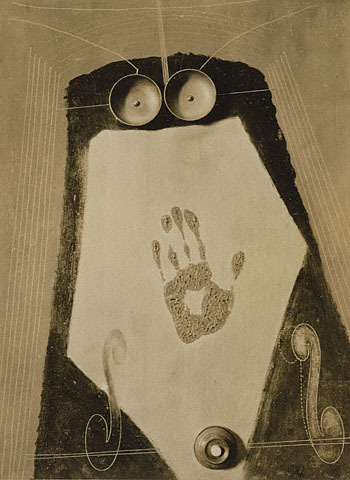 |
| Self Portrait, 1916, Man Ray |
This piece seems quite vague and the fact that it's a portrait isn't apparent but it seems like it tries to convey the personality or sense of the person in a conceptual way, focusing more on this than the actual appearance.
My Portrait


So this became my final self portrait - it's not very obvious but there is a face, with the tube being the nose, the cog and acorn the mouth and the pink buttons and blue balloon the eyes. It was meant to show my way of working again, of narrowing and funneling out ideas, but to be honest I now prefer the more straight appearance of the first portrait idea, as it's more visually interesting.
Rose
Rose said that she really liked to write, so I wanted to show this in her portrait.

She also has blue eyes and blonde hair, so I incorporated these colours as well as the letters for the interest in writing and the screws for her working and thinking quickly with her writing. It didn't resemble much of a face though.

So for the final portrait I wanted to have more of a face in there, even though it's still quite hidden, being made from the pen lids as a nose and mouth and the tape as an eye. I liked how placing the tape coming from the light bulb made it look like an old fashioned ticker tape/ news machine and was showing her coming up with new ideas in her writing. But still the face isn't as obvious as I would like it to be - I think it too complicated and something simple would have been more effective.
Charlotte
I didn't have a lot of time on Charlotte's portrait, but ironically I think it's the best one as I kept it really simple.
I wanted to focus on Charlotte's piercings as she said that she had 19 of them, which was quite an unusual, but interesting fact. So I looked for anything with holes in them to show this.

I love the effect of combining them with the hook as it shows the piercing element, plus the face is really expressive just from these simple shapes. Also Charlotte said that she likes reality TV, which to me always aims for that shock moment and I think this is shown a bit in the expression, which is a nice addition.
Overall, I liked thinking in 3D as it reduced any pressure that I might have felt about drawing the people, but I need to think more simply and about immediate visual appearance as this gave the best effect.
No comments:
Post a Comment