Designers from the sheet
Fred Baier
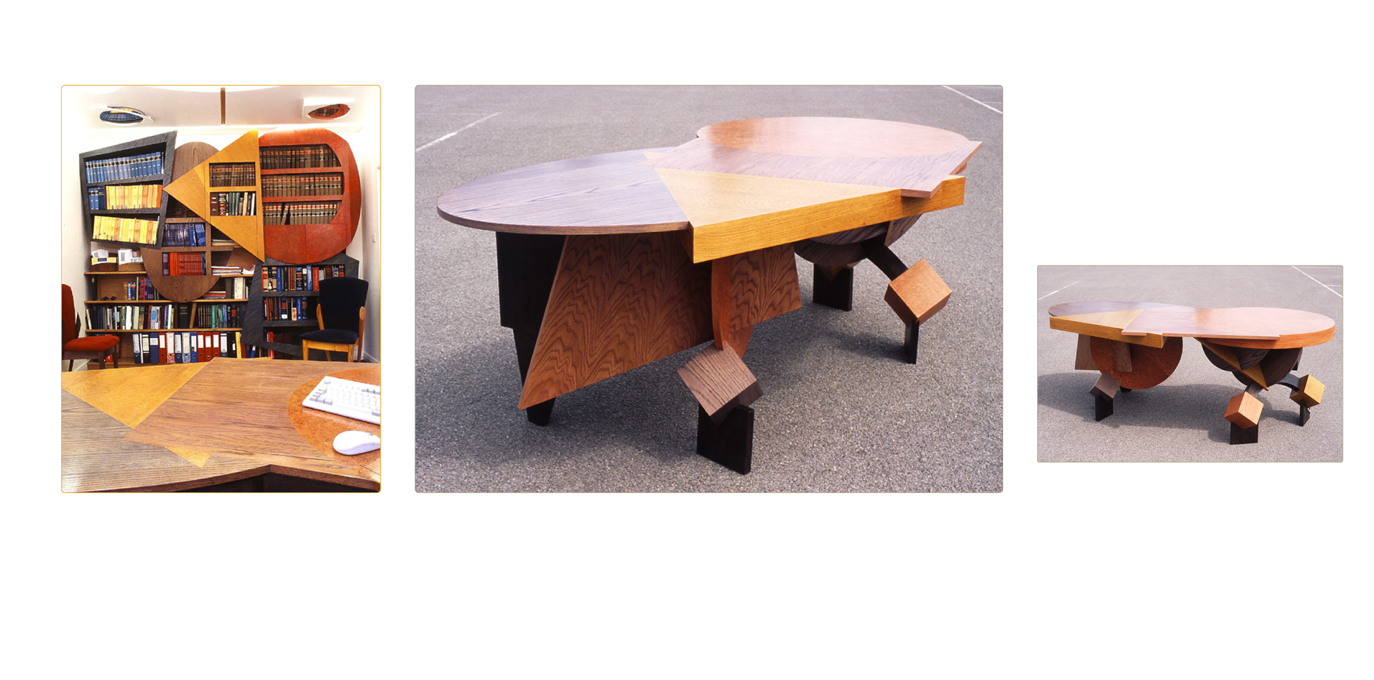 |
| Mr Kessler's Office |
Image from http://www.fredbaier.com/gallery/at-work
I love this piece by Baier because it's so fun and energetic, yet it's practical. It seems to re-invent the space, expanding and pushing into it with weighty geometric shapes. It's amazing and apt description is 'Dr Caligari meets Russian Constructivism 100 years on' and you can really see the rigid, bent forms of 1920's german expressionism in the bookcase, how the block shapes consume and overlap in the space with jutting angles. I'm a fan of films like Dr Caligari and Metropolis that fill a location with flat, angular shapes that are still able to convey the emotions of a scene and show their own emotions despite being a set and Baier seems to capture that same formal expressive sense in this piece. The combination of flat, 3D and 3D shapes that appear flat really create a mix of different forms, that's visually interesting to look at.The use of primary colours as well creates a playful atmosphere because of the link to school designs and colours, but it's subtle enough to still look professional and bright. I really like this design as while it's expressive and focused on style, it's restrained enough to keep it's purpose in mind.
Alessi - LPWK and Blaess Steven
 |
| Marli, fruit holder |

Image from http://www.alessi.com/en/3/2209/baskets-fruit-bowls-centrepieces/marli-fruit-holder
When looking at this piece I'm not sure whether I fully like it or not as although I'm a fan of clean shapes and a strong expression of form, it just doesn't appeal to me. On the one hand I like the sleek, almost clinical nature of it as it looks modern and bold, but it's the general form that I think is the problem - it makes it looks too claustrophobic because of the central bends. They look as if they might get in the way and scratch your hand, particularly because of the thin metal used, or contain the fruit too much so that you can't reach the centre of the holder without tipping it up, which defeats the purpose. Especially as the sides are curved, pushing the fruit into the centre I feel it's not using the space efficiently as fruit can't be piled in.This all may be down to the image though as I think that it doesn't allow you to judge the scale very well, but still the whole form of it doesn't feel right as it simultaneously seems too open and too compressed.
Found Designers
Joe Colombo
 |
| Smoke Glass, 1964 |
When I first read the description about this, I wasn't sure about the point of a glass allowing you to smoke and drink at the same time. But as I found out that the glass has actually been used by people with limited manual dexterity, I began to like the glass as it actually solved a problem that it hadn't intended to. To use the glass the stem is placed between your thumb and index finger, so that the glass rests on your hand instead of you having to actively hold it. In terms of the appearance of the glass I like how simple and clean it it - there's nothing extra and it doesn't draw unnecessary attention to itself, so it fits it's new purpose really well for people that may wish to use it discretely. The stem of the glass intrigues me as it looks almost too thin to support the glass, but I like how it seems to defy logic. The only aspect that I don't like is the weight and size of the bottom of the glass as it seems too large and thick compared to the light looking glasses. It makes it look too much like a glass holder, rather than part of the design to me, but never the less I generally like the glasses because they have a different purpose now, but are still able to fulfill this need.
Arne Jacobsen
 |
| Teapot, 1967 |
I love this sleek design by Jacobsen as it's minimalist, but also slightly quirky. The first aspect of it that I noticed was the handle which has the look of a key to it because of the circle at the top, but also because of the contrast between the curves on the inside of the handle with the straight lines of the outside. It's quite a distinctive contrast as it makes the shapes look really bold, but I also like the slope of the curve in the inside, providing movement and form. Additionally I love how there's almost symmetry in the design with the long spout, which again looks quirky because of it's low position, mirroring the curve of the handle. It's all kept really simple with defined simple shapes, but it looks practical as well, with the handle being a distance away from the body of the teapot to avoid burns. To me although it might appear basic because of the use of stainless steel instead of a decorative design, it's still expressive enough to be visually interesting.
Bauhaus Designers
Josef Albers
 |
Satztische (Stacking Tables), 1926
|
I was attracted to this piece as it's another simple, but bold design. It instantly looks practical and concerned with purpose, with the only extra feature appearing to be the colours of the tables which make it look more fun, like it could become part of anyone's home. It's purpose is what really interests me though as it's such a useful design to have tables that are of different heights, but can all be stacked into one, saving space. Although I'm perhaps not a complete fan of the use of wood on these designs as it doesn't look as portable, easy to manage or as sleek and efficient looking at metal would, this is just a reflection of when they were designed and it does work well with the assumption that they were made for public everyday use.
Marianne Brandt
 |
| Aschenschale mit Zigarettenablage (Ashtray with cigarette holder), 1924 |
I'm not quite sure how I feel about this piece as while I like the emphasis on form and the mix of shapes, it's the added emphasis from this on weight that I don't like. It just looks too bulky and suited to one location rather than being moved around, so to me it looks more like a paperweight than an ashtray. I think it's that a lot of the space is superfluous as well. It hasn't been used efficiently enough as the actual ashtray takes up only a small fraction of this design, so that personally I think it only just meets it's purpose and is more inclined to be considered as a sculpture rather than a product. However I do like the inclusion of the cigarette holder as the simple, lighter, straight form of this stands out well against the circular ashtray and it has a clear purpose. It's bold, but it feels too sculptural and indulgent for me to be a great design that meets it's intended purpose.
No comments:
Post a Comment