The Graphic Design posts are a bit jumbled up, so this blog is about the whole week of work in general.
I was quite looking forward to Graphic Design as I've done work experience at two graphic design companies before and I'd enjoyed designing. But what I didn't realise was how much drawing would be involved this week and I was very pleasantly surprised about this. We began by drawing mind maps on what we thought graphic design was before pooling everything together as a group and discovering that a lot of us made the mistake of assuming that almost everything designed, particularly for advertising purposes, was graphic design, which it wasn't.
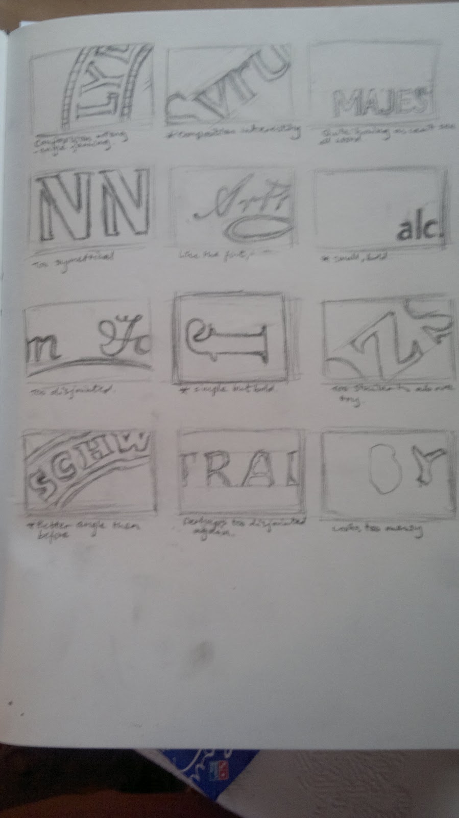
We spent the rest of the day focusing on drawing in graphic design looking at typography in particular, which meant first creating backgrounds using ink and collage and then finding text on products (packaging). We were each given one product and we had to find 3 pieces of interesting text on it, though it could be just a letter or the whole word. To plan how we were going to use the text we did thumbnail sketches which meant drawing 3 small rectangles to plan out the composition and making 3 different designs so you could pick your favourite to go on one of the backgrounds. I'd never done thumbnail sketches before, but I loved drawing them as you could work on the composition and possible ideas without pressure. After we had designed 3 ideas for the one product we then replicated this process on another 3 products. Below are all of my thumbnail sketches.
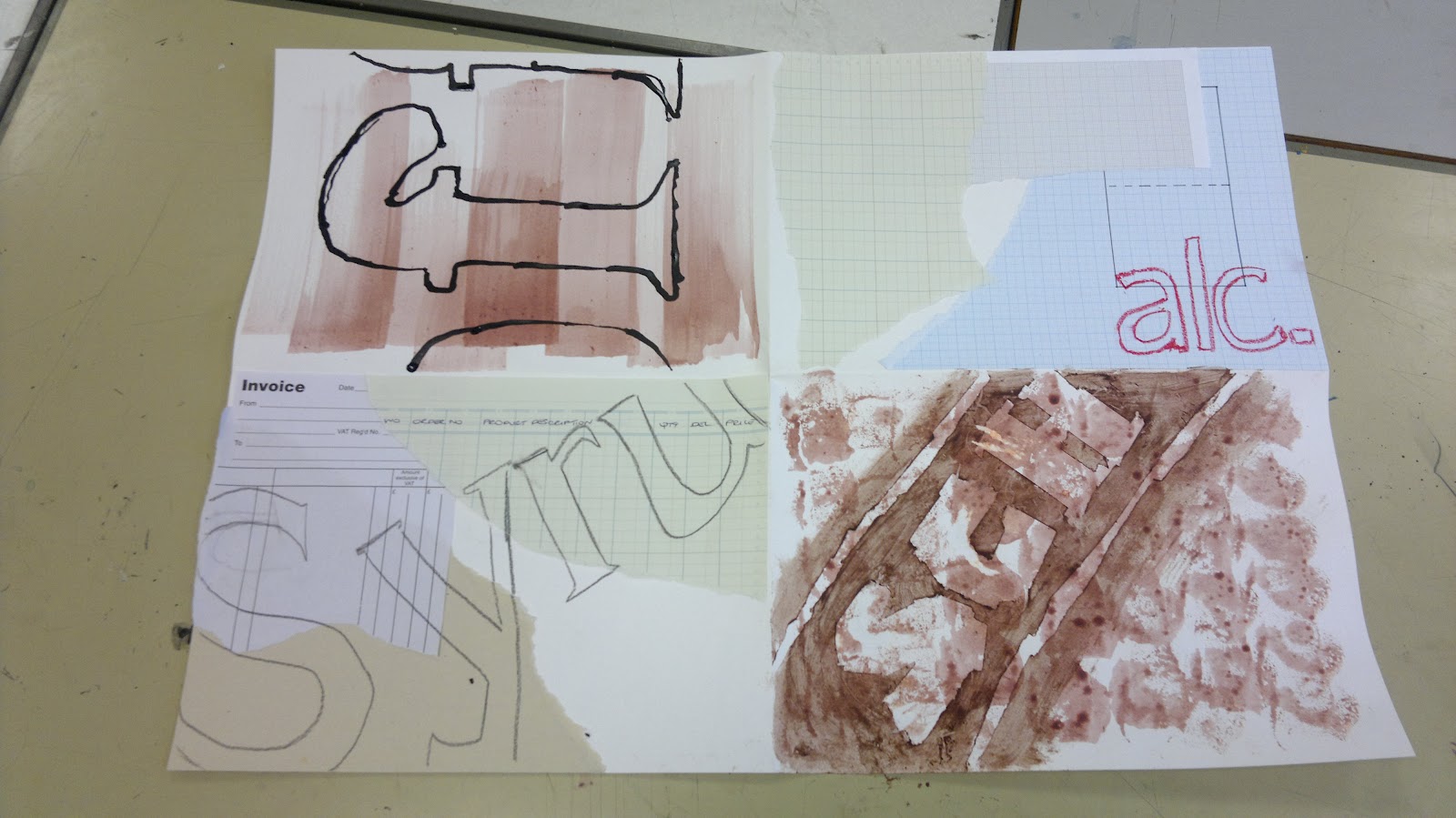
We then selected our favourite design from each product (I tried to select totally different ones to make it more interesting), ready to add to one of the 4 backgrounds that we had made earlier.
But instead of just adding them however we wanted we had to use a different process each time. First we had a graphite stick and we had to do a continuous line drawing, then we had an oil pastel and we had to draw not using our writing hand (so using the left hand for me), then we used ink and a long stick which we had to hold at the end to draw with and finally masking tape and shoe polish. I'd never tried to draw in most of these ways, particularly with shoe polish and masking tape, which I thought was an unusual idea but such a brilliant use of materials and it looked great. I think this was to get us used to thinking differently about drawing and to use different techniques and initially I felt a bit of trepidation because of how permanent the materials were and I didn't want to ruin my backgrounds, but I loved experimenting with drawing and learning some new techniques. This exercise also gave me a greater appreciation of the text all around us and how varied typography can be on a single item. Before I'd never really consider text that much, but now I find myself looking for it and the different typefaces on products.
 |
| The final image |
From then on we focused in Graphic Design on our typography project which involved creating 4 A4 designs bade on different words. The whole process seemed to be about shortlisting, of designing and then deciding on the best design afterwards to give us more options on the route we could take. We started with 7 words and created mind maps on them all on our thoughts and feelings towards them and then we took the words and drew at least 6 thumbnail sketches for possible typography designs that reflected the words' natures. Below are my designs.
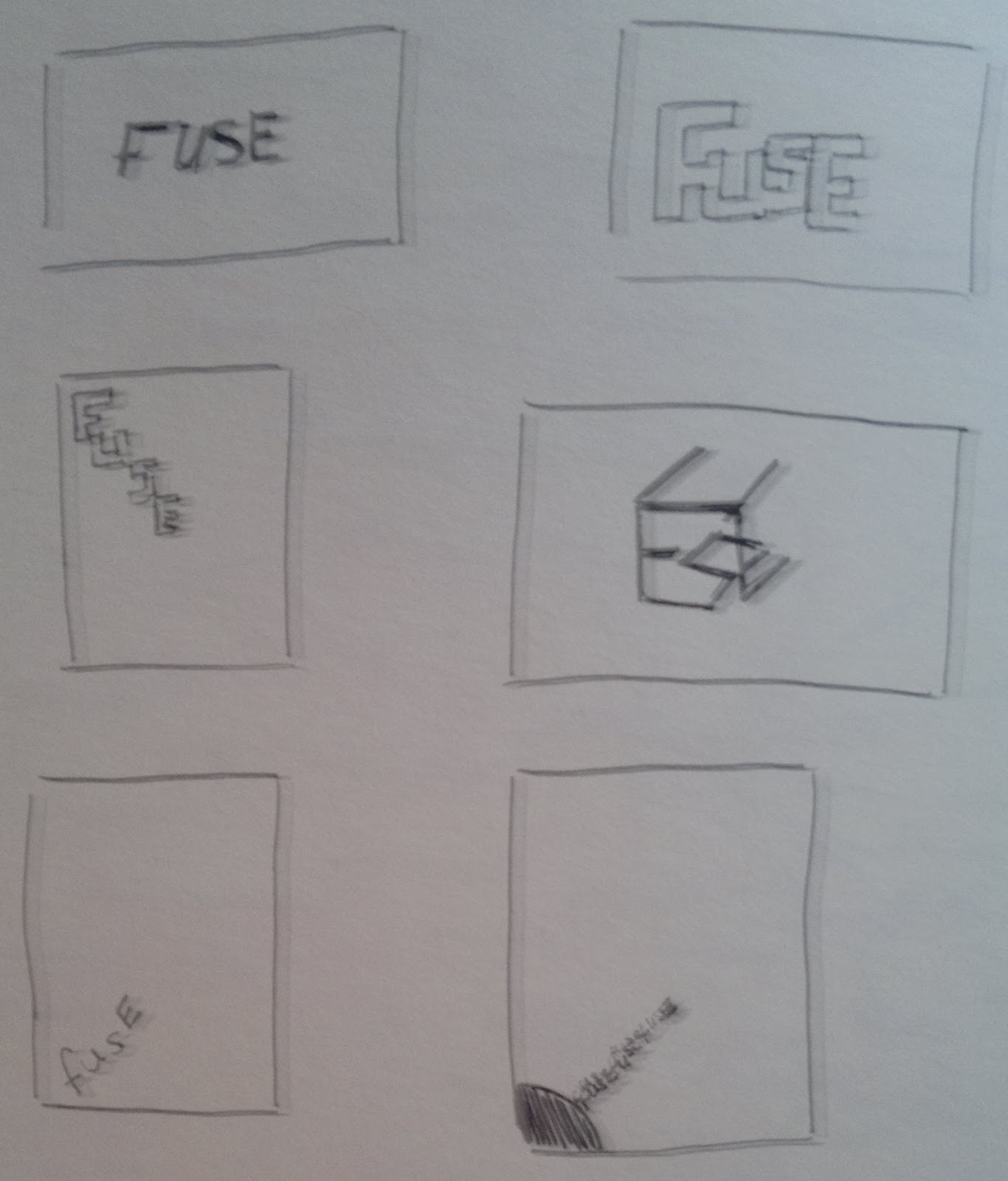 |
| Fuse |
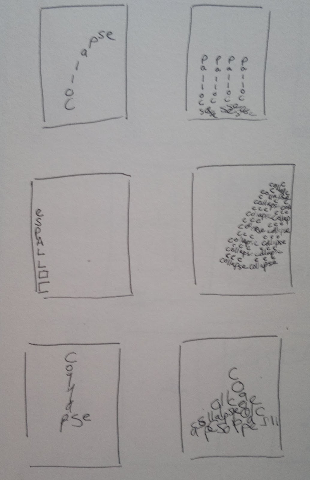 |
| Cascade |
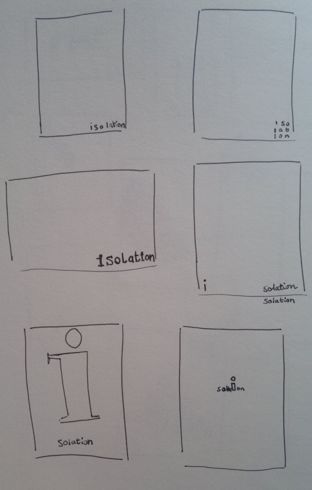 |
| Isolation |
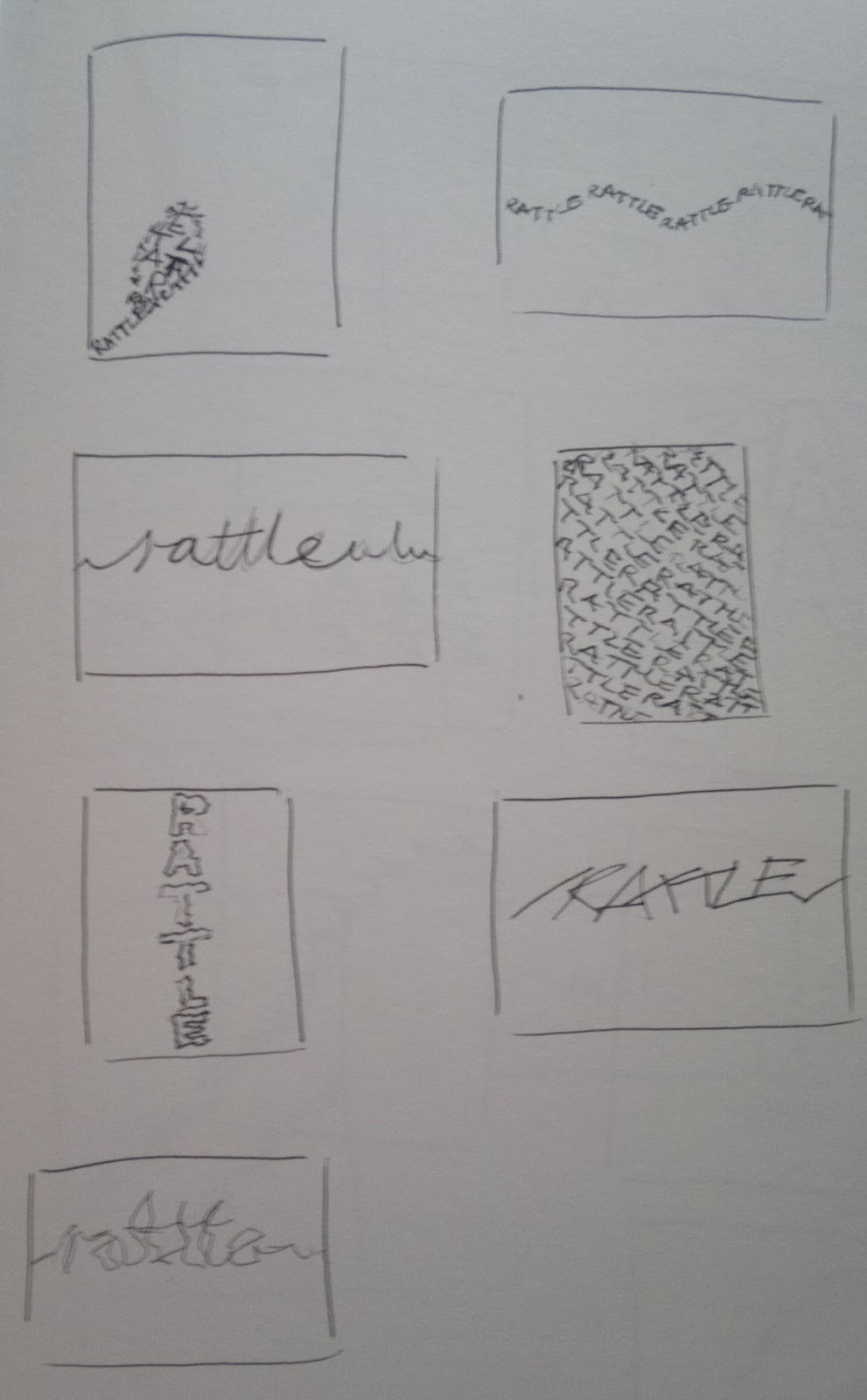 |
| Rattle |
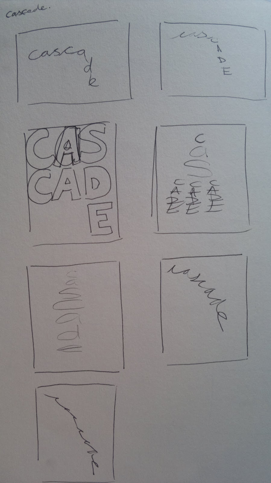 |
| Cascade |
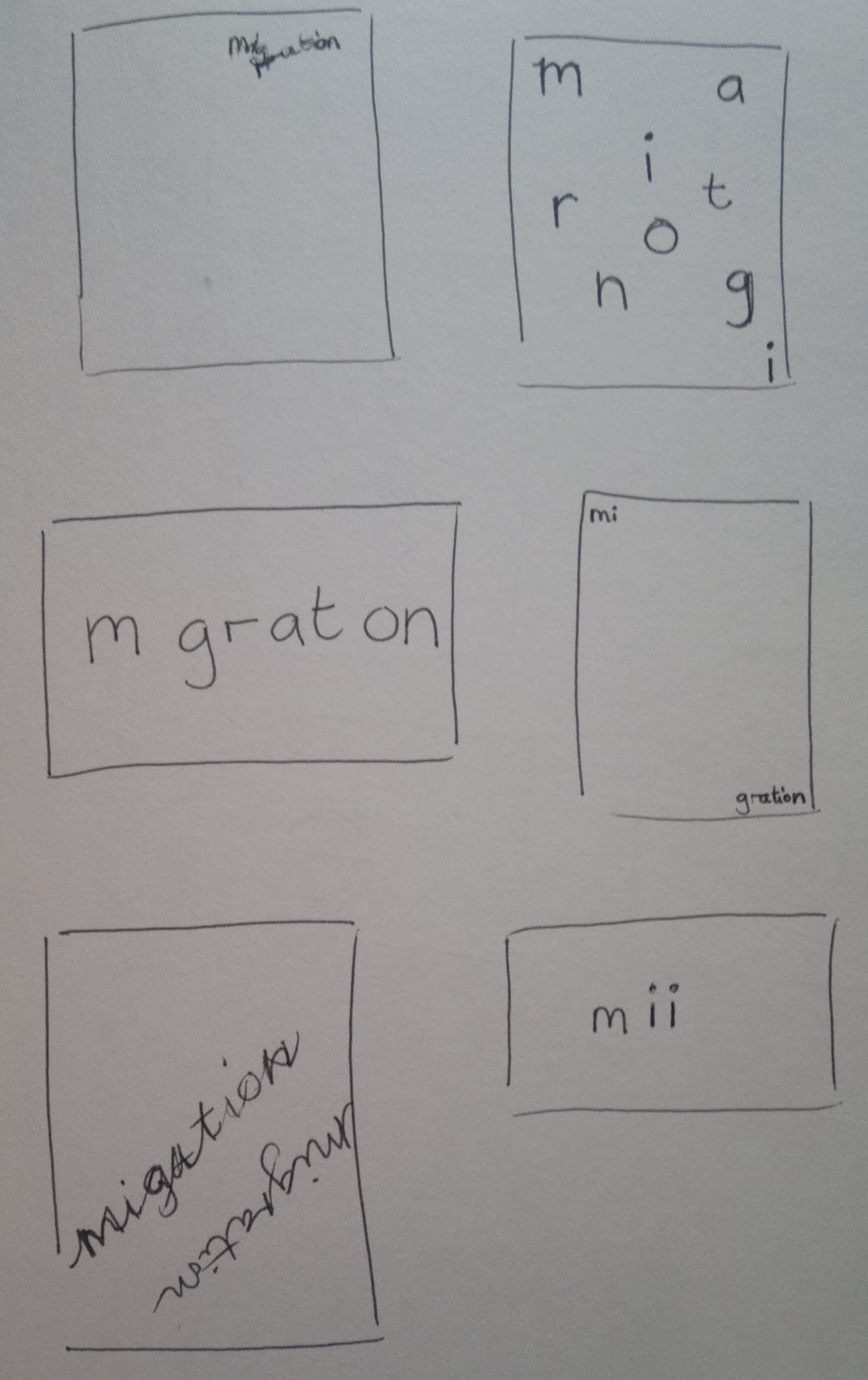 |
| Migration |
 |
| Balance |
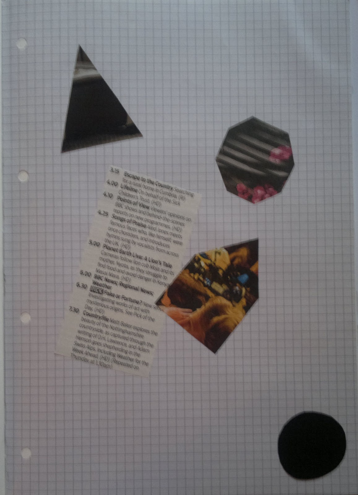
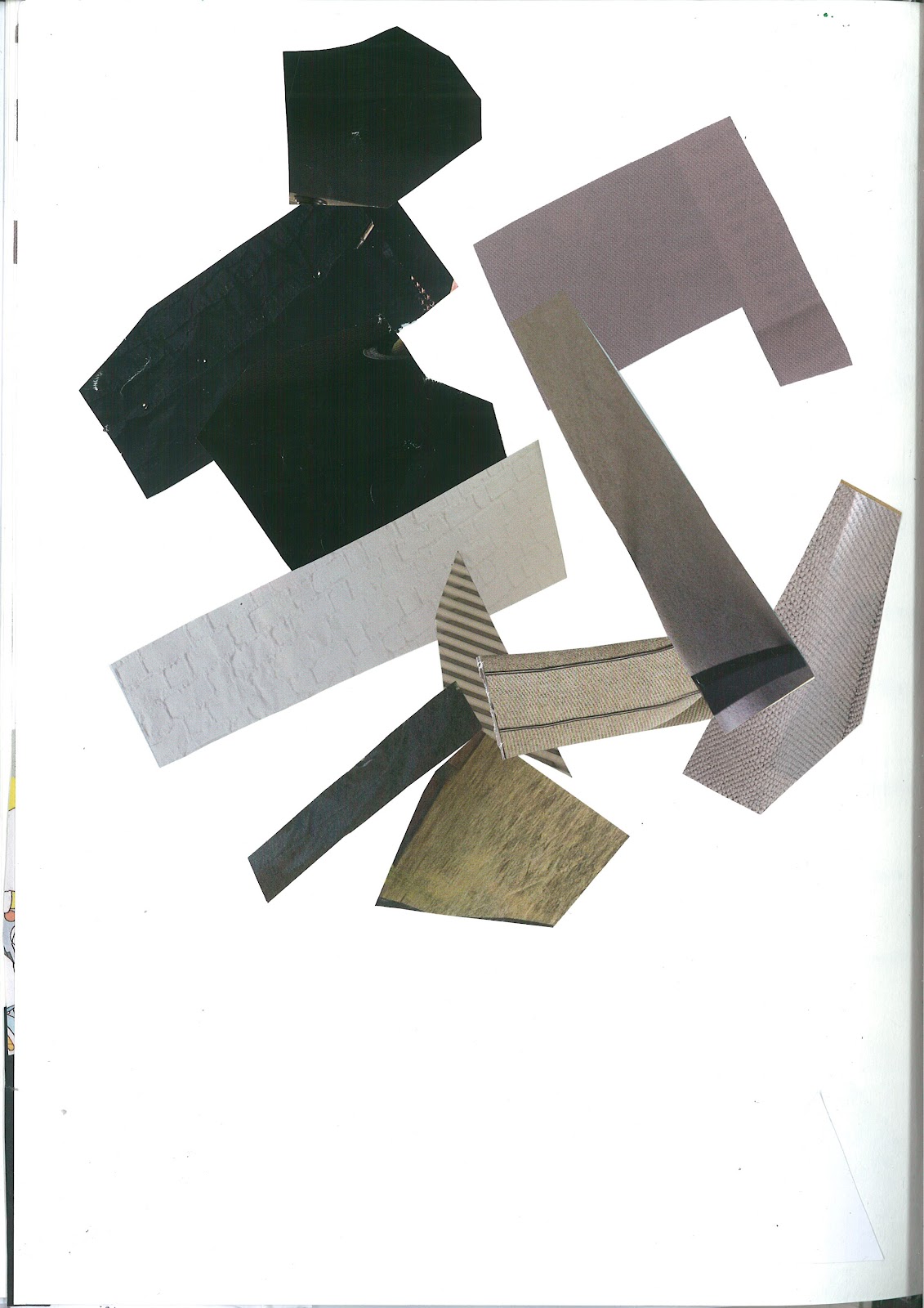
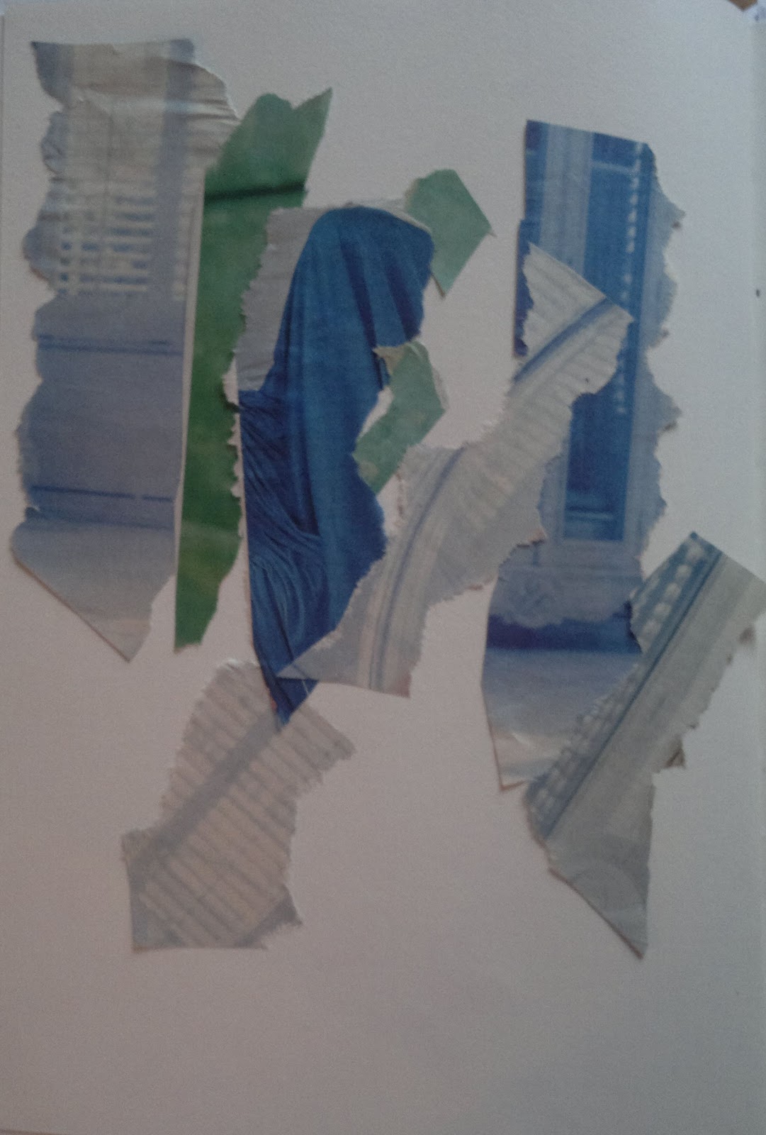
Leaving the designs for a while, we thought about what colours we associate with the words, illustrating this with small shape based collage pieces.
This was to help with creating backgrounds for the designs, which we then moved onto. We had to create 2 different backgrounds using collage for each word, ready for the words to be applied to later on the computer. Initially I was a bit confused about this process, but when I realised that we were shortlisting the backgrounds down, it made sense to me although I sometimes found thinking of different designs difficult as I wanted them to be visually interesting. Below are all of the backgrounds:
 |
| Fuse |
 |
| Fuse |
 |
| Isolation |
 |
| Isolation |
 |
| Cascade |
 |
| Cascade |
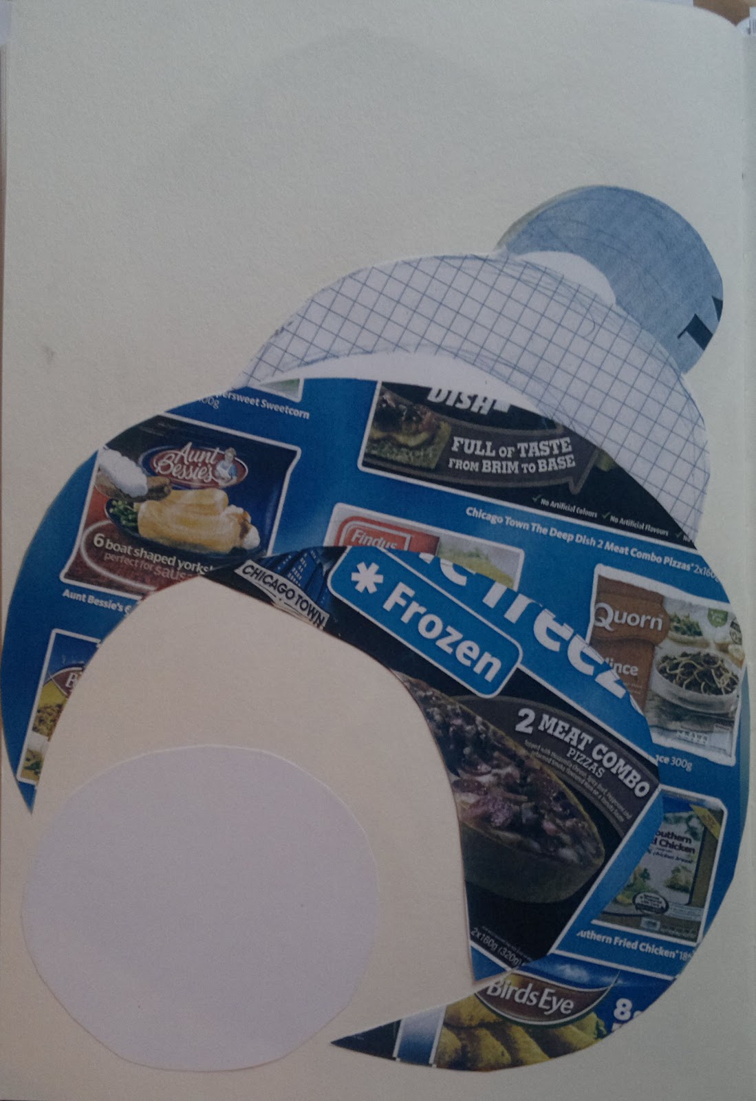 |
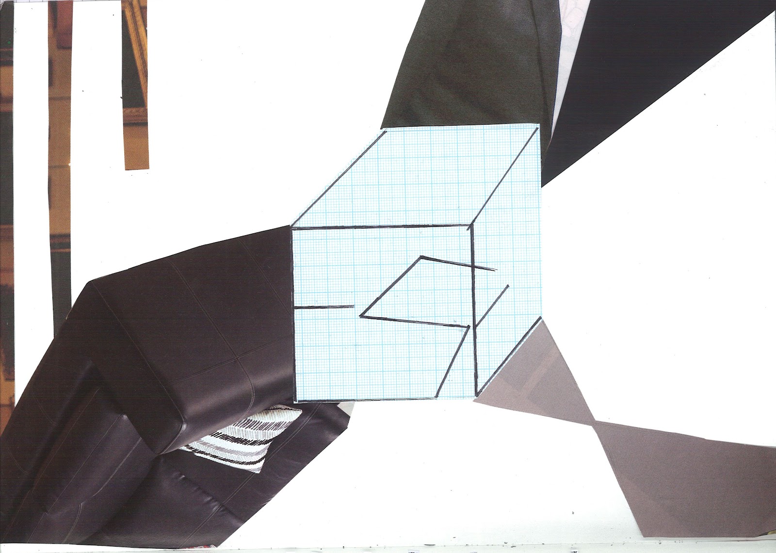
| Balance |
 |
| Balance |
We were encouraged to play around with the photocopier and printer where colours could be changed and I tried this several times and the results were quite good. I did change the complete colour of one of my designs for
Balance though and I was really surprised by the results. By just using black and blue the colours of the image became quite dark and vivid, but the only way I thought that I could add this piece to my original design would be to cut pieces out and stick them over the coloured images. When seeing if the colours would work together by placing the designs next to each other, the colours looked too different to work for me. It looked like the composition would be off and focus would be on the images, not the typography, so although this experiment looked good, I left it out of the design.
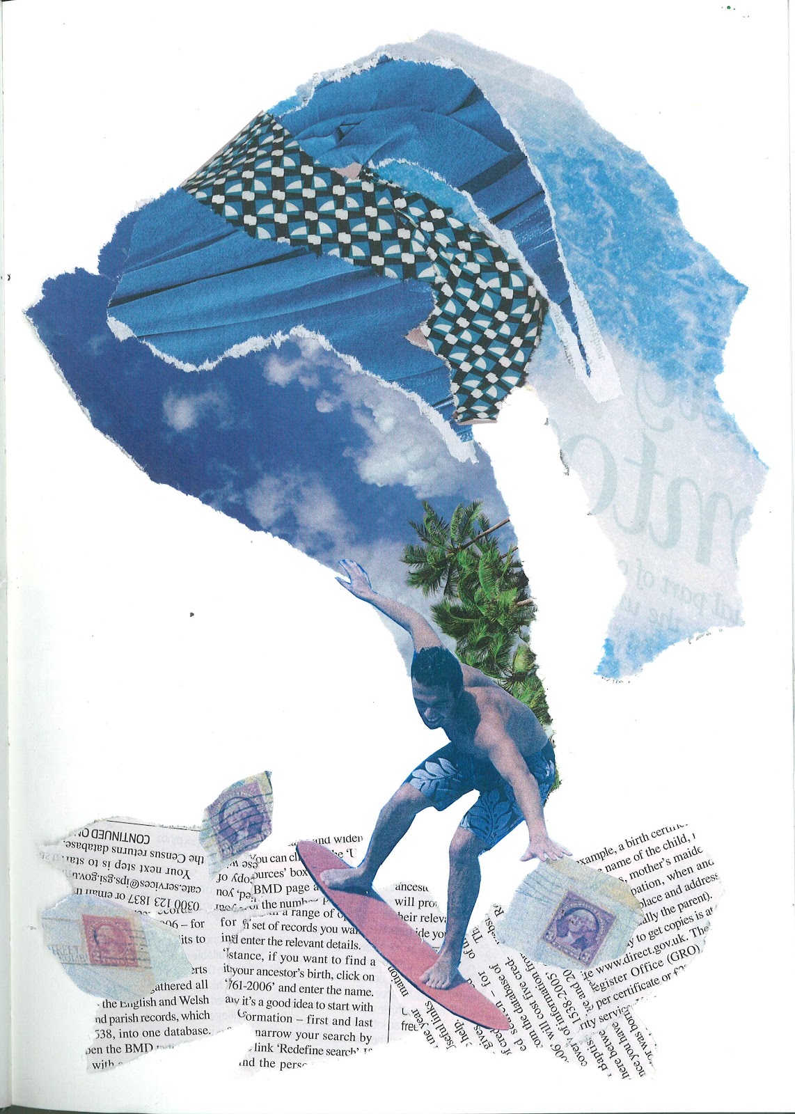
After completing all of our designs we selected the 4 final backgrounds which we would add our text designs to. I chose these designs mainly because I thought they were more interesting, offering greater ways to position the text as well as providing a background that as well as supporting the words, was also good to look at itself:
|
| Fuse |
|
| Isolation |
|
| Cascade |
|
| Balance |
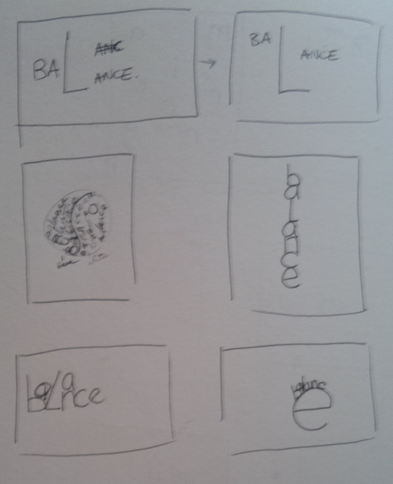
To test out the designs, to see if the typography would fit with them we duplicated the images, creating thumbnails of them really and then drew the text on. For example:
 |
| Balance Thumbnail |
I found these thumbnails really useful for planning, especially for the
Balance design as I hadn't planned the text for the background. But with the thumbnails I could see how the text would interact with the background and consequently I decided to change the position of the text so that it became a part of the background, resting on the shapes, which I think looks a lot better and ironically balanced in terms of composition.
After this we scanned the backgrounds into the computer and then edited them using photoshop to enhance the colours, using the
Hue/Saturation, Brightness/Contrast and
Levels tools. I never knew that an image could be improved so much just by using Photoshop as the images seemed to look quite professional after editing them as the colours were brighter/ darker and the tones deeper - I was really impressed with what you could do. Finally we added the text on Photoshop, allowing us to use different fonts, colours and to position the text how ever we wanted. The only image that I didn't add a typeface to was the
Cascade image as I wanted a hand drawn look to the text. So I drew the text out, scanned this into the computer, edited it to make the text darker and easier to see and then positioned it onto the background using Photoshop, which meant that my original background could remain clean.
The final images can be seen in
this blog post.
This process was a lot of work because of shortlisting everything, but I really enjoyed it and I think my final images are better for this as I had to select the best designs each time, not settle for my first idea.


