This blog focuses on answering the questions set by Graphic Design this week.
1. The 6 main disciplines of Graphic Design are Advertising, Packaging/ Promotional, Branding, Editorial, Corporate Identity and Web Design.
2. The graphic design magazines in the library are Creative Review, Eye and Computer Arts and I chose the article The shape of a pocket from the Autumn 2011 edition of Eye.
The Shape of a Pocket Article - Eye Magazine
I chose this article as I was aware of the Penguin book cover series before and I love looking at that series and book covers in general, so the article immediately appealed to me. I didn't know that there was almost a French version of this series for philosophy books, which seems a greater challenge than designing covers for novels because of the lack of tangible concepts in these books. Consequently, I'm amazed at the appearance of each cover, at how different and imaginative they are in terms of look and their actual process of creation from everything down to the insistence of text placement in the middle of the page. It seems a shame that the designer of the covers, Henry Cohen, isn't well-renowned for this work.
3. The Design Museum is a museum dedicated to showcasing innovative design from worldwide designers and architects that was founded in 1989 by Terence Conran. It's currently based on the South Bank in London, but will be moving to the Commonwealth Institute in West London and hosts exhibitions, educational programmes and collections. The museum also holds every year the Designs of the Year Awards which celebrates designs of the past twelve months, where a judging panel of design experts select the best designs from a range of categories: Architecture, Transport, Graphics, Interactive, Product, Furniture and Fashion. This year's overall winner was for the London 2012 Olympic Torch designed by Edward Barber and Jay Osgerby and commissioned by the London Organising Committee of the Olympic and Paralympic Games (LOCOG).
Image from www.designboom.com
The graphic designer/ illustrator Alan Aldridge has exhibited at the Design Museum in the past, holding a retrospective of his work between October 2008 and January 2009 titled The Man With The Kaleidoscope Eyes, which references his influence in the 60's and 70's. He has designed pieces for The Beatles' album covers, the Penguin book cover series and Heineken adverts among others.
Information from www.designmuseum.org and www.alanaldridge.com
4. Stefan Sagmeister
Image from www.sagmeister.com
I like this poster because of the mix of different type faces and how it's arranged so that the text changes sizes, spacing and position considerably, but the poster doesn't seem messy. It creates a fun impression, yet it isn't overbearing by looking too busy. I think this is down to the great composition as the strong image and the text I think could have overpowered each other, but they are kept in the balance.
Wim Crouwel
Image from www.wikipedia.org
I really like Crouwel's typeface because initially it reminded me of the fact that people can still read words if the first few and end few letters are kept in the same place, but the middle letters can be mixed up. The typeface is made up of only straight lines so sections of letters can't be seen, but you can still tell what they are and I found it quite fun to decipher some of them when I first saw it. It was originally made for computers and I like that it's probably easier for a computer to generate/read than it is for people, fitting the client almost.
Information from http://www.design.nl/item/wim_crouwel_on_his_80th_birthday
Alan Fletcher
Image from www.designmuseum.org
I really like this logo because of how clean and simple it is, but it conveys so much about Victoria and Albert. I love that the 'A' is cut in half but connected to the '&' as it portrays to me Victoria's devotion to Albert and that they were complete together, yet his life was cut down and Victoria had to stand alone. Even the colour black to me shows the sustained mourning period of Victoria where she wore only black. Plus the formality of the text shows how they had to remain regal at all times. I think it's a great logo because it's clear but possibly conveys meanings beyond branding.
Kris Sowersby
Image from http://www.vllg.com/KLIM#panel=news-gallery
I like this type face because of it's appearance - it looks just like a stencil effect. You wouldn't think that just by leaving a slight gap between sections of a letter that it would convey the appearance of a stencil so well and so instantly. But I think it does while combining the practicality of a typical type face in that's it's still easy to read, Sowersby doesn't let the stencil motif overwhelm it.
Pep Carrio
Images from http://www.pepcarrio.com/filter/Identidad/Maria-Moliner
I loved this design initially because of the clever imagery, which suggests the nurturing effect of books on our lives and relates to how Maria Moliner wrote the detailed dictionary Diccionario de uso del español. The image is kept simple in block colour and by using this same colour on the text it really highlights how prominent Moliner is and what the image is related to. The type face as well,which is slightly informal, helps to make the whole design contemporary.
Noma Bar
Image from http://www.dutchuncle.co.uk/system/pictures/2334/large/IBMOutcomes_Poster%206.jpg?1285587316
I looked at a range of Bar's work and I really loved it as a lot of his pieces are minimalist and simple in design yet conceal hidden elements, which are quite often comical, like the poster above. Particularly with the poster above you get the initial image and then after a few seconds you recognise that the plate, knife and fork actually make a pig's face - I really do enjoy the moment of realisation with the works. For this poster the flat bright colours really help to make a subject that can be quick dry into an entertaining piece, helping to improve IBM's image for me. The placement of the text and typeface I think are also important, as it's quite informal and they let the image do most of the work, which again makes IBM seem more relaxed. This placement gives the pig a surprised look on his face as well highlighted by the brown text colour, making the poster even more comical. Overall, I think it's very effective.
1. The 6 main disciplines of Graphic Design are Advertising, Packaging/ Promotional, Branding, Editorial, Corporate Identity and Web Design.
2. The graphic design magazines in the library are Creative Review, Eye and Computer Arts and I chose the article The shape of a pocket from the Autumn 2011 edition of Eye.
The Shape of a Pocket Article - Eye Magazine
I chose this article as I was aware of the Penguin book cover series before and I love looking at that series and book covers in general, so the article immediately appealed to me. I didn't know that there was almost a French version of this series for philosophy books, which seems a greater challenge than designing covers for novels because of the lack of tangible concepts in these books. Consequently, I'm amazed at the appearance of each cover, at how different and imaginative they are in terms of look and their actual process of creation from everything down to the insistence of text placement in the middle of the page. It seems a shame that the designer of the covers, Henry Cohen, isn't well-renowned for this work.
3. The Design Museum is a museum dedicated to showcasing innovative design from worldwide designers and architects that was founded in 1989 by Terence Conran. It's currently based on the South Bank in London, but will be moving to the Commonwealth Institute in West London and hosts exhibitions, educational programmes and collections. The museum also holds every year the Designs of the Year Awards which celebrates designs of the past twelve months, where a judging panel of design experts select the best designs from a range of categories: Architecture, Transport, Graphics, Interactive, Product, Furniture and Fashion. This year's overall winner was for the London 2012 Olympic Torch designed by Edward Barber and Jay Osgerby and commissioned by the London Organising Committee of the Olympic and Paralympic Games (LOCOG).
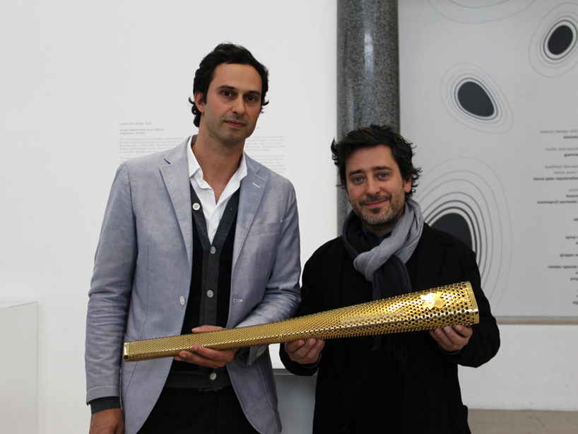 |
| Edward Barber and Jay Osgerby with their winning design |
Image from www.designboom.com
 |
| Penguin Book Cover |
Information from www.designmuseum.org and www.alanaldridge.com
4. Stefan Sagmeister
 |
Aiga New Orleans Jambalaya poster, 1997 |
Image from www.sagmeister.com
I like this poster because of the mix of different type faces and how it's arranged so that the text changes sizes, spacing and position considerably, but the poster doesn't seem messy. It creates a fun impression, yet it isn't overbearing by looking too busy. I think this is down to the great composition as the strong image and the text I think could have overpowered each other, but they are kept in the balance.
Wim Crouwel
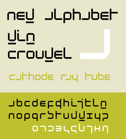 |
| Typeface New Alphabet, 1967 |
Image from www.wikipedia.org
I really like Crouwel's typeface because initially it reminded me of the fact that people can still read words if the first few and end few letters are kept in the same place, but the middle letters can be mixed up. The typeface is made up of only straight lines so sections of letters can't be seen, but you can still tell what they are and I found it quite fun to decipher some of them when I first saw it. It was originally made for computers and I like that it's probably easier for a computer to generate/read than it is for people, fitting the client almost.
Information from http://www.design.nl/item/wim_crouwel_on_his_80th_birthday
Alan Fletcher
 | ||
| Visual identity of the Victoria & Albert Museum, London, 1989 |
Image from www.designmuseum.org
Kris Sowersby
 |
| Version 1.0, 2009 |
Image from http://www.vllg.com/KLIM#panel=news-gallery
I like this type face because of it's appearance - it looks just like a stencil effect. You wouldn't think that just by leaving a slight gap between sections of a letter that it would convey the appearance of a stencil so well and so instantly. But I think it does while combining the practicality of a typical type face in that's it's still easy to read, Sowersby doesn't let the stencil motif overwhelm it.
Pep Carrio
 |
| Identity for Marain Moliner, 2006 |
 |
I loved this design initially because of the clever imagery, which suggests the nurturing effect of books on our lives and relates to how Maria Moliner wrote the detailed dictionary Diccionario de uso del español. The image is kept simple in block colour and by using this same colour on the text it really highlights how prominent Moliner is and what the image is related to. The type face as well,which is slightly informal, helps to make the whole design contemporary.
Noma Bar
 |
| IBM Poster |
Image from http://www.dutchuncle.co.uk/system/pictures/2334/large/IBMOutcomes_Poster%206.jpg?1285587316
I looked at a range of Bar's work and I really loved it as a lot of his pieces are minimalist and simple in design yet conceal hidden elements, which are quite often comical, like the poster above. Particularly with the poster above you get the initial image and then after a few seconds you recognise that the plate, knife and fork actually make a pig's face - I really do enjoy the moment of realisation with the works. For this poster the flat bright colours really help to make a subject that can be quick dry into an entertaining piece, helping to improve IBM's image for me. The placement of the text and typeface I think are also important, as it's quite informal and they let the image do most of the work, which again makes IBM seem more relaxed. This placement gives the pig a surprised look on his face as well highlighted by the brown text colour, making the poster even more comical. Overall, I think it's very effective.
5. After looking through some of the graphic design books I found these designers whose work I liked:
Saul Bass
| Seven Samurai Poster |
Image from www.rllmukforum.com
To be honest I was already a fan of Bass' work as I love looking at film posters and so had seen examples of his work before. However the latest book containing most of his work was in the library and it reminded me of all the different areas of design that Bass was involved with, from movie posters to logos. One of the pieces that I saw in the book was the Seven Samurai poster which I think is beautiful and quite visually arresting - it's incredibly simple, but it tells you everything that you need to know about the film by the use of red and the tally that it involves violence and from the brush work that it's set in Japan.
I also saw the Girl Scouts logo that Bass designed and this reminded me of how since his original design all that had been done to update it was to change the hair styles. It signifies how great a designer Saul Bass was that his logos don't need changing much, when other organisations have to keep updating their logos.
 |
| How the logo was changed |
Image from http://www.mediabistro.com/unbeige/saul-bass-iconic-girl-scouts-logo-gets-bangs-nose-job_b8370
Nicolas Bourquin - Onlab Company
 |
| Map of Dubai's art scene for Wallpaper magazine, 2011 |
Image from www.onlab.ch
I couldn't find online the exact piece that I had seen in the library but I found this piece just as interesting in it's portrayal of figures which can often be quite dull to look at. Here the information is still prominent but the appearance of the page is just as engaging. I think the colour scheme is also a strange choice for an art related page - you'd expect bright colours but it mixes the bright yellow with the more statistical looking grey with the dark black to create a design that is in perfect balance between art and statistics.
Nathan Burton
English Journeys Cover Series - Penguin books
 |
 |
 |
Images from http://bookcoversanonymous.blogspot.co.uk/2010/07/nathan-burton-english-journeys.html
I found a selection of these in a graphic design book and although they perhaps lean more towards illustration it's the use of a standard layout and different typefaces for the titles that I think makes the series, though the illustrations are also beautiful. The oval shape gives the books a more traditional feel, which fits the material perfectly just like the different typefaces used which suggest the tone of the books. My favourite example is of SOME COUNTRY HOUSES and their Owners because the text starts very rigid and formal before becoming more softer in lowercase and then returning to upper case for Owners, with a slightly bent w that creates space between the w and n. Just through the text it suggested to me about the authority of the owners, although I can't confirm whether it relates to the material as I haven't read the book before.
KNARF (Company)
 |
| Design for School of Visual Arts |
Image from www.adsoftheworld.com
I liked this work because of the initial idea of it of turning the environment into different objects related to education by playing with scale. I couldn't find a picture of it but my favourite from the book was of a set of bike stands turned into a piece of paper, with the stands acting at the margin holes in the paper. It looked amazing and so professionally done, that it promoted the school just by being clever with design, showing that the school was a bit out of the box and it didn't even use any text.
Barkley (Company)
These advertisements for Johnson County Library by Barkley were featured in a design book.


Images from http://osocio.org/message/trucks_as_part_of_the_message/
I love these as they have an immediate effect because of the clean, bold design but also from knowing the novels and realising the puns. It's a great piece of advertising because it engages you instantly as well known novels are mixed with less well known books, appealing to avid book fans and the general public. When the realise that it's for a library it seems even cleverer and promotes a modern impression of the library.
Goodby Silverstein & Partners Promotional Agency
Image from www.goodbysilverstein.com
This wasn't the piece that I originally saw in the books in the library, but it included the same feature that I liked in the other piece, which was the use of block colour to create a simple but visually striking image that grabbed my attention immediately.
Images from http://osocio.org/message/trucks_as_part_of_the_message/
I love these as they have an immediate effect because of the clean, bold design but also from knowing the novels and realising the puns. It's a great piece of advertising because it engages you instantly as well known novels are mixed with less well known books, appealing to avid book fans and the general public. When the realise that it's for a library it seems even cleverer and promotes a modern impression of the library.
Goodby Silverstein & Partners Promotional Agency
 |
| Screenshot of GS&P's work for the anniversary of the Golden Gate Bridge |
This wasn't the piece that I originally saw in the books in the library, but it included the same feature that I liked in the other piece, which was the use of block colour to create a simple but visually striking image that grabbed my attention immediately.
No comments:
Post a Comment