Sunday, 11 November 2012

Life Drawing (7) - Ipads and graphite

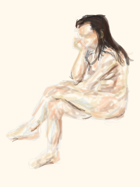
Unfortunately our group missed Life Drawing last week because of a teacher training day so we didn't have a chance to use paint, however we used the Ipads this week which enabled us to try colour and texture still.

I'd used an Ipad to draw with once before when I attended the college's Ipad day and I'd quite liked using them as it was a different way to draw, but one that still relied on drawing techniques.

In this session the focus was on experimenting and trying the Ipads out. I wanted to get used to using the Ipad, so I started by just sketching.


 But by duplicating the image we could then experiment with different techniques, like layers, opacities and colours without the worry of ruining the first image.


On this image I tried adding a light peach background to form a sort of basic skin tone, before adding some shading on top. I thought that this was a great aspect of using the Ipad, that you could instantly use any colour, set backgrounds and move layers around to get different effects. The tool that I used the most though was the opacity tool, as you didn't have to commit to full, bold colour, you could apply it in shades and layers.

I did the same for the next image - of sketching the figure out first and then adding colour. 


In this image and the later ones I always had trouble with the hair. I think this was because with hair if it doesn't have a lot of tone and detail, it can look quite flat. If I had more time I would have worked more on the hair to try and rectify this.

For this image I tried a different way of working, starting with no outline or drawing lines, just working immediately with blocks of colour and building it up with these.  This was a harder way of working and it required a lot of corrections along the way, but it built up colour really quickly.


 After trying that way of working, I tried another way, of sketching first in a flesh colour and then using a variety of brush strokes to add various textures. I liked being able to experiment with the brushes really quickly, having the option to instantly use another tool if I didn't like the effect.


I started to add sketch lines and darker tones on this duplicate

I like the lined brush as by dotting them around the figure they help to lead your eyes around the figure. The darker shades gave more definition, as did the sketch lines, which stand out a bit too much for me here, but by working on it more I think they would merge better while emphasising the form of the figure.

 I quite liked working with the Ipads as it allowed me to make quick sketches and use different colours and textures easily - it's easy to see the benefits of them and why artists are using them. But because I'm not very confident with them yet my drawing style reverted back to sketchy lines, instead of clean ones and I missed being able to use my whole arm to draw with. However, it was great to learn how artists are exploiting this technology.

For the second half of the day we focused on graphite drawings, except using the graphite loosely, on it's side or pushing it vertically up the page, not using it precisely like a pencil. The aim was to create quick drawings that included shading by any methods really - there wasn't a wrong way to use the graphite (except like a pencil for the first two).


For this one I used the graphite mainly on it's side pushing it vertically across the page. I think this was just because it was my first try and so I wanted to practice getting the figure down first before focusing on shading, which this method allowed me to do. It seems quite accurate structurally, but I think that if I had more time on it I would have exploited the graphite and it's shades more.


As the light source changed I was able to get some nice definition on the arms just by using the white space and the surrounding shades to suggest form and consequently I like how this turned out. I was worried about over working areas and of losing this definition, but for the most part I think being quite conservative in areas has worked well as did using more of the whole stick of graphite to create blocks of shape and shade. The hands are just markers at the moment and the background, although providing good context for the figure, was done in the last few seconds so both could have been developed more, had I had more time, to create more defined shapes. I think using some darker shades on the background to emphasise the folds in the material would have made it look great as well as pushed the figure forward.


As the technique worked well before I did a similar type of process on this final drawing, except that I used the whole stick of graphite more this time, pushing it all across the page. I liked that this picked up the marks on the board behind the paper, as it made the image seem more personal to the artist rather than a depiction of the model. I found this pose interesting as we'd never done one where the model holds an object so it was quite strange to have to plot where it would go and to try and line it up, but it could also be used as another reference point, which was helpful. I like on this image how the form of the model is emphasised again by the use of blocks of shade and light, it seems to add weight to the pose.

I enjoyed working with graphite as it could be controlled and manipulated quite easily but in various ways to get different interesting effects. It felt quite loose as you could use the whole stick of graphite to commit shapes down quickly and roughly, but still achieve definition.

This was our final life drawing session and while it was often tiring, I think I'm going to miss the sessions as they made me concentrate fully and made me think about the marks I was making and what I was seeing. The sessions have really improved my use of line, making it more clean and defined and my technical ability in drawing a figure as well. I've enjoyed seeing my work develop each week and learning new drawing techniques, plus it's given me a lot of skills that I can use in almost all areas of my future work.

Wednesday, 7 November 2012

W8 - 3D Product Design Week: Perspective

First we began by thinking about the theory behind Product Design, which involved researching different designers so that we could have some context to the area and to practice commenting on their works. Afterwards we had a chance to see how design has developed in products like phones to meet changing needs as well as to utilise the technology available. We also saw examples of classic design in a coffee maker and how updating a design doesn't always mean improving it as well.

To practice how we see an object and then interpret it in a clear way we then moved onto a drawing exercise. We had to select on object and then draw it only using simple lines with graphite, there couldn't be any shading or sketching. As we'd done continuous line drawings in previous weeks I tried to use what I'd learnt there here with this exercise, only committing definite lines to the page. While I initially chose my object because it was complicated and interesting, I grew to regret this choice when I had to draw it. I think it turned out ok, but it looks a bit too stout to me, so I welcomed another chance to re-draw the object.


This time though we could only commit 20 marks to the page. To begin with I thought that this wouldn't be enough, but by using a continuous line it meant that I could save on making excessive marks and be more conservative, while having enough to draw all of the object. I quite liked this way of drawing as it forced you to look at what was necessary to include in the design to be able to convey the object. As Kathy said though as we'd already drawn the object before, it became harder this second time to keep looking at the object instead of relying on what your brain said it should look like. I do think that this second attempt looks more like the object though, perhaps due to practice and from being more considerate with lines.


For the final part of the day we focused on one and two point perspective drawings, which show how an object looks, using boxes to illustrate this. First we looked at two point perspective. This meant first establishing the horizon with two horizontal points, drawing a straight vertical line between and below/above them and then drawing lines from the points to the line to create the box, showing how it extends into the horizon.

Here's my first attempt.

Two point perspective
As it seemed slightly technical I was a bit hesitant at first as I wanted to get it right, especially as we were working in biro, but the process was easy once I'd got the hang of it. 

Next was one point perspective which seemed a bit harder to me because the technical side seemed easier to get confused with because you had less points of reference. To draw this though you just had to set a point, draw a horizontal line, join the line to the point with other lines and then draw in the sides of the front of the box before adding the extra sides in.

Here are my attempts.

One point perspective
Finally we learnt about shading in Product Design. To begin with we had to draw 4 boxes on a page, a mix of one and two point perspective ones, to shade. This was done by establishing two light sources for the box, one was always the front (where the viewer looks on) and we could choose the second. Then we just had to shade using pencil crayon from dark to light, etc in varying degrees following our light sources. However we also had to add in streaks of light (white unshaded areas here) to show that the boxes are made of plastic, which was done by simply leaving gaps in the shading and adding dark lines after each gap. To make the boxes look professional we then used the 'thick and thin' line technique, which meant that anything touching the air would have a dark line and everything else would have a thin line. This added definition to the boxes, but to add depth we also included a quick background of just a sketched out rectangle behind the box to create an added reference point.

Shaded boxes
I really like this final image as the boxes look quite bold, but the process was actually quite easy. I found today really useful as before I'd had no actual training on one and two point perspective. Now though I can use it and apply it to other areas to improve the technical side of them.

Tuesday, 6 November 2012

W8 - 3D Product Design: Designers

For 3D Product Design this week we have to find out more about the area by looking at the work of designers and commenting on their work.

Designers from the sheet


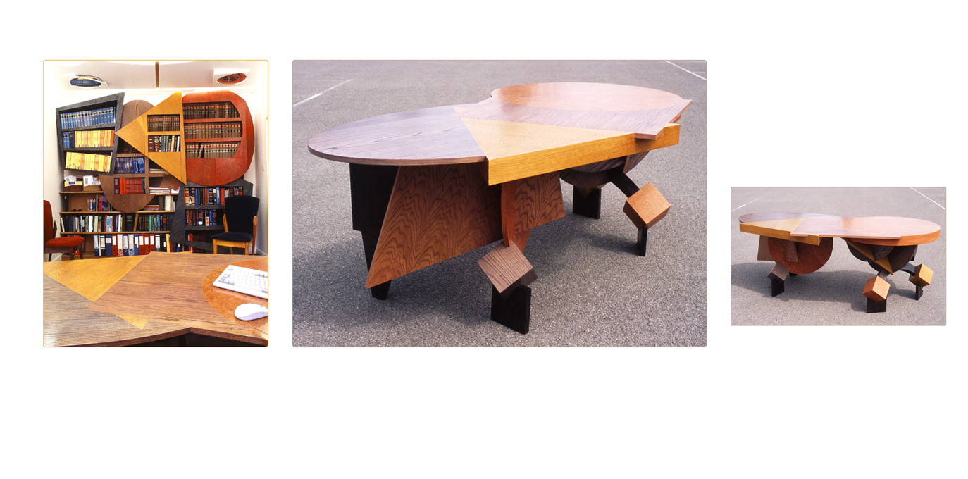
Fred Baier
Mr Kessler's Office

Image from http://www.fredbaier.com/gallery/at-work

I love this piece by Baier because it's so fun and energetic, yet it's practical. It seems to re-invent the space, expanding and pushing into it with weighty geometric shapes. It's amazing and apt description is  'Dr Caligari meets Russian Constructivism 100 years on' and you can really see the rigid, bent forms of 1920's german expressionism in the bookcase, how the block shapes consume and overlap in the space with jutting angles. I'm a fan of films like Dr Caligari and Metropolis that fill a location with flat, angular shapes that are still able to convey the emotions of a scene and show their own emotions despite being a set and Baier seems to capture that same formal expressive sense in this piece. The combination of flat, 3D and 3D shapes that appear flat really create a mix of different forms, that's visually interesting to look at.The use of primary colours as well creates a playful atmosphere because of the link to school designs and colours, but it's subtle enough to still look professional and bright. I really like this design as while it's expressive and focused on style, it's restrained enough to keep it's purpose in mind.

Alessi - LPWK and Blaess Steven

Marli, fruit holder


 Image from http://www.alessi.com/en/3/2209/baskets-fruit-bowls-centrepieces/marli-fruit-holder


When looking at this piece I'm not sure whether I fully like it or not as although I'm a fan of clean shapes and a strong expression of form, it just doesn't appeal to me. On the one hand I like the sleek, almost clinical nature of it as it looks modern and bold, but it's the general form that I think is the problem - it makes it looks too claustrophobic because of the central bends. They look as if they might get in the way and scratch your hand, particularly because of the thin metal used, or contain the fruit too much so that you can't reach the centre of the holder without tipping it up, which defeats the purpose. Especially as the sides are curved, pushing the fruit into the centre I feel it's not using the space efficiently as fruit can't be piled in.This all may be down to the image though as I think that it doesn't allow you to judge the scale very well, but still the whole form of it doesn't feel right as it simultaneously seems too open and too compressed. 

Found Designers


Joe Colombo


Smoke Glass, 1964

When I first read the description about this, I wasn't sure about the point of a glass allowing you to smoke and drink at the same time.  But as I found out that the glass has actually been used by people with limited manual dexterity, I began to like the glass as it actually solved a problem that it hadn't intended to. To use the glass the stem is placed between your thumb and index finger, so that the glass rests on your hand instead of you having to actively hold it. In terms of the appearance of the glass I like how simple and clean it it - there's nothing extra and it doesn't draw unnecessary attention to itself, so it fits it's new purpose really well for people that may wish to use it discretely. The stem of the glass intrigues me as it looks almost too thin to support the glass, but I like how it seems to defy logic. The only aspect that I don't like is the weight and size of the bottom of the glass as it seems too large and thick compared to the light looking glasses. It makes it look too much like a glass holder, rather than part of the design to me, but never the less I generally like the glasses because they have a different purpose now, but are still able to fulfill this need.

Arne Jacobsen
http://www.stelton.com/~/media/STELTON/Downloads/OL-LOW/OL_04-2_TeaPot.ashx
Teapot, 1967
Image from http://www.stelton.com/en/Category/Products/04-2_Tekande.aspx

I love this sleek design by Jacobsen as it's minimalist, but also slightly quirky. The first aspect of it that I noticed was the handle which has the look of a key to it because of the circle at the top, but also because of the contrast between the curves on the inside of the handle with the straight lines of the outside. It's quite a distinctive contrast as it makes the shapes look really bold, but I also like the slope of the curve in the inside, providing movement and form. Additionally I love how there's almost symmetry in the design with the long spout, which again looks quirky because of it's low position, mirroring the curve of the handle. It's all kept really simple with defined simple shapes, but it looks practical as well, with the handle being a distance away from the body of the teapot to avoid burns. To me although it might appear basic because of the use of stainless steel instead of a decorative design, it's still expressive enough to be visually interesting.

Bauhaus Designers

Josef Albers


Satztische, 1926
Satztische (Stacking Tables), 1926
 Image from http://bauhaus-online.de/en/atlas/werke/stacking-tables

I was attracted to this piece as it's another simple, but bold design. It instantly looks practical and concerned with purpose, with the only extra feature appearing to be the colours of the tables which make it look more fun, like it could become part of anyone's home. It's purpose is what really interests me though as it's such a useful design to have tables that are of different heights, but can all be stacked into one, saving space. Although I'm perhaps not a complete fan of the use of wood on these designs as it doesn't look as portable, easy to manage or as sleek and efficient looking at metal would, this is just a reflection of when they were designed and it does work well with the assumption that they were made for public everyday use.

Marianne Brandt

Aschenschale mit Zigarettenablage, 1924
Aschenschale mit Zigarettenablage (Ashtray with cigarette holder), 1924

I'm not quite sure how I feel about this piece as while I like the emphasis on form and the mix of shapes, it's the added emphasis from this on weight that I don't like. It just looks too bulky and suited to one location rather than being moved around, so to me it looks more like a paperweight than an ashtray. I think it's that a lot of the space is superfluous as well. It hasn't been used efficiently enough as the actual ashtray takes up only a small fraction of this design, so that personally I think it only just meets it's purpose and is more inclined to be considered as a sculpture rather than a product. However I do like the inclusion of the cigarette holder as the simple, lighter, straight form of this stands out well against the circular ashtray and it has a clear purpose. It's bold, but it feels too sculptural and indulgent for me to be a great design that meets it's intended purpose.

Sunday, 4 November 2012

W7 - Fashion Week

Unfortunately we didn't get very long with Fashion this week as we had a lot of guest lectures and friday was a teacher training day.

Fashion began though by discussing what fashion actually is and what I really liked about this was that it was suggested that Fashion is all about ideas. It reminded me how contemporary and imaginative fashion can be, it isn't all about high street clothes.

From this we learnt that our aim for the week was to create an item, constructed out of paper, that focused on form and was built out of shapes, but could be perhaps worn. We started by designing the shape that we would use by taking a template, mine was for a waistcoat, and by cutting it, expanding it, curving it we had to create new shapes from it, drawing around it to record them and then moving on and changing it even more to develop the shape. We had to do this using tracing paper as well as the template until we felt that we had developed it enough. To begin with I wasn't sure whether the waistcoat template would be too complicated to make a good shape out of, but it actually supplied a lot to work with, helping to make an interesting final shape. I liked using the tracing paper also as it allowed you to take shapes that you liked from lots of designs and combine them into one shape easily.

Below is an image of the (almost destroyed) template and the shapes which were developed from it.


I also tried using masking tape, which involved sticking some down and then drawing around it and the template to extend the shape even more.  I really liked this as it complicated the shape quickly, creating more connections between sections and making it look more exciting.

Experimenting even more we were encouraged after using the photocopier to copy our shapes to A4, to reverse the colour using the negative settings so that our shapes came out as a white outline on a black background.


The negative image
The original copy

I found this effect really interesting as it looks almost like a chalkboard drawing, in particular the animation Humorous Phases of Funny Faces. Working with this I then tried it using the template to see the effect that they would create, as suggested.


The copied image

The negative image

I loved this effect as the negative copy contains some great contrasts with the bold white lines standing out on the grey and black background. It showed me another way to look at designs, combining lines and collage to create different layers.

This was my final developed shape. I stuck with this shape as while it looks quite complicated, it offers a lot of movement and different sections that I thought could be used for different effects.


After creating our shapes we enlarged them to over A3 and then made copies of these onto cartridge paper, ready to be used to make our final item.

Here is the enlarged shape.


With our shapes Sue then taught us different ways to score using a craft knife and fold the paper so that it could be bent and manipulated in various ways. For instance so that it created box shapes or using circular scoring so that the shape could be compressed to form a tighter shape, or left loose to maintain a hanging shape. I couldn't believe that paper could be used in this way to create such defined and imaginative shapes and forms, especially as this was quite easy to do, all you had to know was how to fold, score and pin paper to a manikin to create the item. 

Below is the process of creating my item.

Some of the angular folds that I used

More compressed folds.
The emphasis for our items was on creating form, particularly forms that didn't follow the shape of the body and instead created a new shape to it.


I started with these folds and shapes, wanting to build up layers.


The photos show the item changing over time as sections were removed as well as added. This was because after creating the flower like shape on the front I wanted to concentrate on the contrast between artificial man-made straight lines and organic flowing forms that capture a lot of energy as the flower shape does that really well. It's a theme that I looked at for Applied Arts as well, so I wanted to continue with it and see how it could be interpreted in a different area and to what effect. I continued to build up the layers though.


The flower shape flew down slightly, but I quite liked this as it spread the emphasis instead of focusing it in one area. This was an advantage of that fold, that it could work well loose or compressed.


The back changed significantly from a plain style that looked quite military to more of a busy, expressive design. This was because the past style looked too separate to the front and the theme as a whole as it wasn't organic enough. So solve this I tried to make the back look almost like wings or feathers, but using straight lines to combine the styles, which I think looks quite good due to all of the layers.

The Final Item


I really was impressed by the use of paper as it kept it's shape amazingly well and was easy to manipulate as well. On my item I tried to make forms that didn't follow the shape of the body too much and because of this my favourite section is the flower shape as it, and the shapes around it, force the form out, creating a lot of movement there.


After making our items we moved onto drawing them by using manikin templates and tracing paper so that we could concentrate on getting the shapes and forms of our designs down and not have to worry about the shape of the body/manikin just yet.
The template
We just had to focus on a line drawing to begin with and then we could complicate it afterwards. Although because my design was so complicated to begin with, this made doing the line drawing a challenge anyway. It took a while to draw all of the folds in, but I wanted to as accurately as possible draw it. I did have problems with the scale at points, so there are a few alterations to the drawing and as I was drawing in fine liner these can still be seen.
A photocopy of the line drawing

A negative of the line drawing
 I did another negative image, which again looked great. I just love that contrast of a black background and strong white lines as it seems to place more emphasis on the lines.

After completing the line drawing though I wanted to do something a bit different so I tried adding light tone to the drawing, using the first drawing as a stencil. Although I tired to rectify some of the scale problems of the first in this second drawing. I think this one is more interesting to look at as the shading creates more depth to the folds, making them easier to see and even more interesting in negative form as well.

We didn't have long on Fashion, but I'm really surprised by how enjoyable it was. I'm not really into fashion, so I thought that I wouldn't be able to connect to some of the tasks this week, but I've loved focusing on shape and form and experimenting with what paper can do. It's made me think more openly about what fashion can be and I've been able to learn transferable skills as well as how to use some more of the special features on the photocopier, so it's been a great week.

W6 - Textiles Week

I didn't know what to expect from Textiles, but it began well by focusing on drawing loosely, using drawing techniques like not looking at the page when drawing, drawing with your left hand, trying to memorise the object and drawing with your eyes closed. It was similar to the drawing exercises that we'd done before, but we had to place an emphasis one creating a good composition and looking at shapes and we got to draw from multiple still life objects on a table which was a nice change.


 We used materials like pastel, felt pen and graphite, which injected colour and different textures into the drawings.

As we were focusing on composition and shapes to extend on these themes we used viewfinders and looking through them at the still life items on the table, we drew 2 compositions, including negative space lines.


I quite liked using a viewfinder as it helped to isolate an area, making it easier to find a good composition. Including the negative space as well helped to fill the image out so that the composition didn't look empty.

The aim was to move onto large paintings that used similar loose working methods, but looked compositionally good. This included using a set colour scheme and a range of materials, like different coloured inks, pastels, felt pen and ink coloured emulsion paint. To test our colour scheme we tried out the materials on a page to see if they did work together. Below is my scheme.


I thought that this was a great idea as it took away the pressure of trying to get a good colour combination on the finished images as you could try it out here.

Then using these materials we did the same process of drawing still life objects using different loose methods, except to make the focus on shape and composition we had to move the paper around at points so lines merged and overlapped. I thought this was quite effective as it stopped forms becoming literal and by using different materials you could achieve different levels to the image. At first the composition wasn't working but we had to continually work on our 3 images, adding and sometimes taking sections away. Although the process was quite intense, fast paced and I wasn't convinced by my images to begin with, I think it showed how just working with an image can make it look good eventually.

Below are the images in progress and finished.

In progress

The finished image
On this image I really liked the use of bleach, which weakened the strength of the ink lines and how much the shapes and lines overlap to create interesting cross-sections, but it doesn't look too busy.
In progress

Finished image
On this image and the one below we stuck together envelopes to form a collage sheet to work on top of, which provided an interesting background and different patterns. For the image above I kept the design quite simple as I didn't want to over complicate it. I think this one of the biggest challenges - of knowing when to stop and when to keep working on an area as you could ruin it or make it better.

In progress

In progress

Finished image
This was my favourite of the images because of the overlapping blocks of colour and lines and the colour scheme of blue, orange, grey and yellow, which works in this balance really well, mixing warm and cold tones.

Although I found aspects of it difficult because the images required working loosely and later refining them, I did like how building the images up created a layered image with intersecting lines that meant the focus was on shapes, rather than the objects. This proved really useful for the textile strips that we made later in the week.

Before making those though we first tried mono printing. I'd never even heard of it before, but I loved the effect of it. It involved covering plates with oil based ink, thinly rolled out and placing your paper on top, before drawing your design into the back of the paper. The ink transfers onto the paper where you've pressed into it, giving you your printed design. This could be done multiple times on the same piece of paper using different coloured inks, like orange, red, blue, light grey and dark grey. It was quite easy to do, but the look the printing gave was great as it actually transferred the pressure and type of line that you created. It has quite a distinctive look as well, creating a stylised appearance that allows line prints as well as blocks of colour. 

For our prints we had to select shapes and composition from our bigger paintings, experimenting with the process to see what different effects we could achieve.

Below are my attempts.

I liked the blocks of colour, but not the sketchy style of the line as it looks a bit messy. There's a bit too much white space as well.
 
I liked the mix of strong block colour and line. I used collage pieces here as well, laying them between the paper and the plate so that when the red layer was added, I couldn't be sure where blank gaps would appear, which was quite exciting. Still a bit too much white space for me though.

Loved this effect of the red and orange colour scheme, as because of the block background it's really bold, but subtle with the line design.

As it worked well before I did another using the same colour scheme. The mottled effect was accidental, but it's really interesting, creating different layers to it. I tried using a rectangle plate as well so that the line design extends over the background, which I really like as it makes it more prominent.

I tried using the rectangle plate again, except at different angles, which makes the print more exciting. But I also tried the light grey ink, which I didn't like as the line drawing in it hardly shows up against the blue background.

I really like the solid block colour in this one as it's really bold. Plus the use of red creates another layer, but it doesn't overwhelm the original blue lines.
I loved just being able to investigate the process and find out what worked and what didn't. This left room for mistakes to happen, which often improved my work, and there wasn't any pressure to make them perfect. I really want to try mono printing again.

Next we moved onto making two A2 textile strips that combined everything that we had practiced so far with a new emphasis on using textile materials like thread, different types of stitching and fabric. We had to make the strips using compositions found on our bigger paintings that we had completed earlier in the week, still focusing on getting a good composition and on shapes, rather than literal objects. Except that they had to form a sort of pair, working together. Personally, I don't think that I accomplished this very well as mine look a bit too separate. I tried to make them similar through the colour scheme and use of materials/ stitch method, but I had two interesting compositions that I wanted to try out rather than focusing on one, so they do look quite different. Still I really enjoyed making them as as we had to work on them both at the same time, they gradually built up as we worked on them more and more. This was like before, where it took a while for the composition to look good and it took a lot of adding, but the effort was worth it as the strips have a lot of different layers and textures because of this method. Usually I'm not a fan of mixed media as well as I find it difficult to balance the 3D and 2D materials sometimes, but I liked adding and experimenting with the textiles. Especially the different types of stitch as because we didn't have a lot of time, we didn't have to be perfect or know how to stitch, we could do anything. Generally, I think that they turned out well.


I really liked how everything that we had learnt accumulated on Friday with the textile strips, so you could see how techniques, like the works themselves, can be built up. Although we'd already practiced the drawing exercises before in other weeks, I've still learnt a lot this week and found another way of working that mixes quick looses drawing technique, with a persistence to just keep working and perfecting a piece. 

I really enjoyed the homework this week as well which was to find 3 textile/ pattern artists' works and write about what we liked about their work. We could also do our own interpretation of their work, which I loved doing as the works that I chose were quite illustrative in their style, so I got to experiment with this in really fun ways. Below are the pages from my sketchbook containing my interpretations as well.


I loved creating my own character for the Donna Wilson interpretation as it was just fun to think of a distinctive vegetable and the feasibility of it having arms and a face and creating a personality for it. As well as making him slightly ugly and quite surly looking.