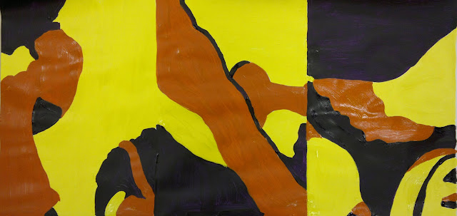
The whole week didn't disappoint as well, as I got to try a new range of techniques, in particular one where we did a 30 minute line drawing of a still life and then cut up a copy of it into 6 rectangles. From these we did A4 abstract paintings.
 |
| The initial drawing |
 |
| The final painting |
It was such a long process for a few images, but that's what I really liked about it - that the end product was so different to the initial drawing, that from something as standard and literal as a still life drawing, something more visually perplexing could be made.
Artists that we looked at this week included Saul Bass, whose work I was already a fan of. I think it's the mark of a great designer when their designs and logos are still being used years after their creation, without the need to change them and without them aging. In his work he seems to be able to communicate so much, so simply.
 |
| Henri's Walk To Paris, 1962, Saul Bass |
Image from: http://www.brainpickings.org/index.php/2012/02/21/henris-walk-to-paris-saul-bass/
I also saw Blexbolex's work for this first time and fell in love with it. He gets so much expression and character into his figures despite them being only block shapes and colours, using the body language to suggest internal thoughts and mannerisms.
 |
| L’imagier des gens, 2008, BlexBolex |
Image from: http://forbiddenplanet.co.uk/blog/2009/from-our-continental-correspondent-blexbolex-named-most-beautiful-book-of-2008/
Here's some examples of the work that I did over the week.
These silhouettes were created without drawings, just by cutting from observation. At first I found it a bit daunting, but I really enjoyed it, although admittedly I'm a sucker for silhouette pieces any way - it never fails to astonish me that a figure or object can be perfectly described just by their basic outline.
For the final outcome we had to select a word from the Fez of Dreams and using shapes and colour illustrate this word. My word was: powerful.
Below are some of my initial experiments.
After doing an observation of a toy polar bear it made me think about humanity's strange need to make anything natural into an artificial form. So that while the toy was technically man-made, it looked more natural. I wanted to explore this as it seemed like an exertion of power, of trying to imitate/ control nature.
The relationship between the colours red, black and white is an interesting one as I think it visually looks strong, but it always reminds me of Russian art work.
I'd planned to only make one final outcome, so the second came about almost by accident after I placed a cutout on top of the black paper. Both work well together though as I like the contrast between strong artificial structures and the weaker natural bird cut out and the other piece where the colours dominate the whole image more aggressively - it seems like two sides of the same word.
While the heavy focus on composition this week, because of the use of simple shapes, was at times a bit challenging as I think it's one of the hardest aspects to get right each time in a piece, my appreciation of colour and shape have only grown. It's amazing the level of detail that you can get into an image, just from colour and shape alone and the range of techniques that can be used to do this. Increasingly I'm finding that simple is the key to great images.


Great post Jodie. I think it would be a good idea to put a link to your blog on your personal statement for UCAS if you haven't done so already.
ReplyDeleteThanks Trudi! I remembered just before I sent my statement to stick it on to the end - but thank you for the advice.
Delete