I saw The Hobbit yesterday and while I loved the film I'm still not sure how I felt about Peter Jackson's use of 48 Frames Per Second instead of the traditional 24.
Image from http://www.empireonline.com/gallery/image.asp?id=64237&caption=
I saw it on an Imax screen, so the quality of the image and sound (which was amazing, particularly in the Gollum scenes as the sound echoes around you) is probably the highest that it could be, so I had a good position to see how the frame rate affected the film. To be honest I really didn't like it to begin with - I know that the aim of films is to try to immerse you fully in the experience, to make it feel like you're there, but it looked too real, like it was being filmed by a cheaper TV standard camera. It was that detailed that it made some things look fake and sometimes a bit cheap, perhaps especially because it is a fantasy film. Other times it was very immersive and the images were crystal clear, but most times it seemed to drag me away from the world rather than pull me into it.
The motion capture technology is only improving though - Gollum is so fully formed that you can see Andy Serkis' features coming through slightly, showing the level of detail that the technology picks up now. However, watching The Hobbit made me miss traditional effects as it is incredibly reliant on computer animation. I know it's a fantasy film and most of the film couldn't be made without it, but seeing CGI used to animate a kite, rather than making a real one, made me feel a bit sad inside. Here's hoping that Smaug is made of plasticine in The Hobbit: The Desolation of Smaug next year.
Saturday 29 December 2012
Room on the Broom
Compared to the hype that the animated adaptations of Julia Donaldson's books The Gruffalo and The Gruffalo's Child got, this year's film Room on the Broom seemed lacking in publicity and it was only a week before Christmas when I heard about it.
Image from http://www.bbc.co.uk/iplayer/episode/p0102qfj/Room_on_the_Broom/
Because of this it surprised me with how good it is - it's incredibly funny, not least because of the Gromit like actions of the Cat, who feels increasingly frustrated by the Witch and resorts to blunt, silent representations of this that seem aimed more at adults than children. The whole film is littered with small, often quick visual jokes and it's charm here is only equaled by the style of animation used. It's computer animation but because of the almost cell-shaded look it has a heavier, denser feeling that reminded me more of stop motion animation than computer. Consequently it almost captured the same quirkiness of stop motion (not quite though, nothing can match that specific level of charm).
In 25 minutes it manages to establish a group of characters and their individual personalities extremely well and usually without the need for dialogue, which I loved as it pushed focus, emotion and strength onto the images. It's immensely enjoyable, though the only thing that I felt a little disappointed at was the use of a similar threat (of being eaten by a monster) like in Donaldson's other books. Despite that I think it's definitely the best out of the Christmas time adaptations so far.
Room on the Broom can be found on the BBC iplayer.
Image from http://www.bbc.co.uk/iplayer/episode/p0102qfj/Room_on_the_Broom/
Because of this it surprised me with how good it is - it's incredibly funny, not least because of the Gromit like actions of the Cat, who feels increasingly frustrated by the Witch and resorts to blunt, silent representations of this that seem aimed more at adults than children. The whole film is littered with small, often quick visual jokes and it's charm here is only equaled by the style of animation used. It's computer animation but because of the almost cell-shaded look it has a heavier, denser feeling that reminded me more of stop motion animation than computer. Consequently it almost captured the same quirkiness of stop motion (not quite though, nothing can match that specific level of charm).
In 25 minutes it manages to establish a group of characters and their individual personalities extremely well and usually without the need for dialogue, which I loved as it pushed focus, emotion and strength onto the images. It's immensely enjoyable, though the only thing that I felt a little disappointed at was the use of a similar threat (of being eaten by a monster) like in Donaldson's other books. Despite that I think it's definitely the best out of the Christmas time adaptations so far.
Room on the Broom can be found on the BBC iplayer.
Empire Magazine: Noma Bar Illustrations
Being a regular reader of Empire magazine I'd seen these illustrations every month in front of the home Review section, but now that there's a feature on them on the Empire website, it just gave me an excuse to talk about them.
Admittedly, I didn't know that they were all by Noma Bar as they just sort of appeared in Empire one month - I thought the art department at Empire had created them because of all the plot references in the images. All of them are charming though and the use of negative space is inspiring (if frustratingly brilliant).
Selection of the illustrations:
My favourite? It has to be Jaws, with the Blu-ray logo for an eye and a droopy, loveable smile that reveals itself to be a face - beautiful and amazingly clever!
The full selection can be found on Empire's website.
Admittedly, I didn't know that they were all by Noma Bar as they just sort of appeared in Empire one month - I thought the art department at Empire had created them because of all the plot references in the images. All of them are charming though and the use of negative space is inspiring (if frustratingly brilliant).
Selection of the illustrations:
The Avengers: Loki what Bar did with the Avengers! |
Citizen Kane: As lovely as Rosebud |
My favourite? It has to be Jaws, with the Blu-ray logo for an eye and a droopy, loveable smile that reveals itself to be a face - beautiful and amazingly clever!
Wednesday 12 December 2012
ABC Printmaking (2)
This session focused on using the practices that we'd learnt last week, like using packaging to print, using stencils to block out colours, layering colours and mono-printing, except we had to combine them with drawings of people that we'd done in our sketchbooks to create figure based prints.
Really bold simple shapes seem to work best with the flat colour of printing. It's getting the composition right every time that I seem to struggle with - I want to plan them out more, but it's often accidental pieces that are the best. Still I was able to use more varied layers this time to see the effects that they'd have. In particular I liked the lined background effect - it's perhaps too much on the image above, but it might be good to use in the future.
This week I was more experimental with the pieces and I think the final prints look better because of this. Also having a focus in the faces helps to center the prints more than the previous abstract ones, but overall I liked just having strong expressions in the prints, it makes them more lively and easier to connect to.
The extra print is simpler and bolder than the intended final image. |
This week I was more experimental with the pieces and I think the final prints look better because of this. Also having a focus in the faces helps to center the prints more than the previous abstract ones, but overall I liked just having strong expressions in the prints, it makes them more lively and easier to connect to.
Illustration: Colour and Shape
I love flat, bold colour and defined shapes, so I was incredibly happy when I found out that our first week long project was Colour and Shape.
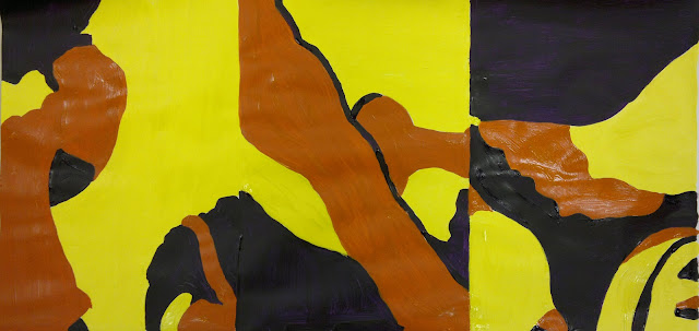
The whole week didn't disappoint as well, as I got to try a new range of techniques, in particular one where we did a 30 minute line drawing of a still life and then cut up a copy of it into 6 rectangles. From these we did A4 abstract paintings.
It was such a long process for a few images, but that's what I really liked about it - that the end product was so different to the initial drawing, that from something as standard and literal as a still life drawing, something more visually perplexing could be made.
Artists that we looked at this week included Saul Bass, whose work I was already a fan of. I think it's the mark of a great designer when their designs and logos are still being used years after their creation, without the need to change them and without them aging. In his work he seems to be able to communicate so much, so simply.
Image from: http://www.brainpickings.org/index.php/2012/02/21/henris-walk-to-paris-saul-bass/
I also saw Blexbolex's work for this first time and fell in love with it. He gets so much expression and character into his figures despite them being only block shapes and colours, using the body language to suggest internal thoughts and mannerisms.
Image from: http://forbiddenplanet.co.uk/blog/2009/from-our-continental-correspondent-blexbolex-named-most-beautiful-book-of-2008/
Here's some examples of the work that I did over the week.
These silhouettes were created without drawings, just by cutting from observation. At first I found it a bit daunting, but I really enjoyed it, although admittedly I'm a sucker for silhouette pieces any way - it never fails to astonish me that a figure or object can be perfectly described just by their basic outline.
For the final outcome we had to select a word from the Fez of Dreams and using shapes and colour illustrate this word. My word was: powerful.
Below are some of my initial experiments.
After doing an observation of a toy polar bear it made me think about humanity's strange need to make anything natural into an artificial form. So that while the toy was technically man-made, it looked more natural. I wanted to explore this as it seemed like an exertion of power, of trying to imitate/ control nature.
The relationship between the colours red, black and white is an interesting one as I think it visually looks strong, but it always reminds me of Russian art work.
I'd planned to only make one final outcome, so the second came about almost by accident after I placed a cutout on top of the black paper. Both work well together though as I like the contrast between strong artificial structures and the weaker natural bird cut out and the other piece where the colours dominate the whole image more aggressively - it seems like two sides of the same word.
While the heavy focus on composition this week, because of the use of simple shapes, was at times a bit challenging as I think it's one of the hardest aspects to get right each time in a piece, my appreciation of colour and shape have only grown. It's amazing the level of detail that you can get into an image, just from colour and shape alone and the range of techniques that can be used to do this. Increasingly I'm finding that simple is the key to great images.
The whole week didn't disappoint as well, as I got to try a new range of techniques, in particular one where we did a 30 minute line drawing of a still life and then cut up a copy of it into 6 rectangles. From these we did A4 abstract paintings.
The initial drawing |
The final painting |
It was such a long process for a few images, but that's what I really liked about it - that the end product was so different to the initial drawing, that from something as standard and literal as a still life drawing, something more visually perplexing could be made.
Artists that we looked at this week included Saul Bass, whose work I was already a fan of. I think it's the mark of a great designer when their designs and logos are still being used years after their creation, without the need to change them and without them aging. In his work he seems to be able to communicate so much, so simply.
Henri's Walk To Paris, 1962, Saul Bass |
Image from: http://www.brainpickings.org/index.php/2012/02/21/henris-walk-to-paris-saul-bass/
I also saw Blexbolex's work for this first time and fell in love with it. He gets so much expression and character into his figures despite them being only block shapes and colours, using the body language to suggest internal thoughts and mannerisms.
L’imagier des gens, 2008, BlexBolex |
Image from: http://forbiddenplanet.co.uk/blog/2009/from-our-continental-correspondent-blexbolex-named-most-beautiful-book-of-2008/
Here's some examples of the work that I did over the week.
These silhouettes were created without drawings, just by cutting from observation. At first I found it a bit daunting, but I really enjoyed it, although admittedly I'm a sucker for silhouette pieces any way - it never fails to astonish me that a figure or object can be perfectly described just by their basic outline.
For the final outcome we had to select a word from the Fez of Dreams and using shapes and colour illustrate this word. My word was: powerful.
Below are some of my initial experiments.
After doing an observation of a toy polar bear it made me think about humanity's strange need to make anything natural into an artificial form. So that while the toy was technically man-made, it looked more natural. I wanted to explore this as it seemed like an exertion of power, of trying to imitate/ control nature.
The relationship between the colours red, black and white is an interesting one as I think it visually looks strong, but it always reminds me of Russian art work.
I'd planned to only make one final outcome, so the second came about almost by accident after I placed a cutout on top of the black paper. Both work well together though as I like the contrast between strong artificial structures and the weaker natural bird cut out and the other piece where the colours dominate the whole image more aggressively - it seems like two sides of the same word.
While the heavy focus on composition this week, because of the use of simple shapes, was at times a bit challenging as I think it's one of the hardest aspects to get right each time in a piece, my appreciation of colour and shape have only grown. It's amazing the level of detail that you can get into an image, just from colour and shape alone and the range of techniques that can be used to do this. Increasingly I'm finding that simple is the key to great images.
Thursday 6 December 2012
Erica Russell
I found two of Erica Russell's animations today, the first Triangle (below) was her first animation. The title relates to the themes of love and jealousy in the film, which is shown through expressive dance.
Immediately the sense of form that Russell achieves in the figures struck me and how by using simple shapes alone she is able to suggest figures and concentrate on the dialogue of their movements, not the intricate details. I like the looseness of the film as well - it seems like she uses stretches the arms of the figures in particular to emphasise the energy in them. My problem with it though is that she creates a narrative between these 3 figures, but it's never resolved, there's no satisfactory ending for them and their battle. I found it interesting though that it's hard to distinguish the female figures as the animation progresses, so that you almost can't root for one figure over another and root for a particular ending, but again this was a bit frustrating as it was harder to connect to the figures because of this.
Next I watched Feet of Song, which is similar to Triangle in it's use of basic figures and expressive dance, but it doesn't have the same strong narrative, which I missed. Feet of Song is all about the dancing and while I liked seeing Russell's technical skill for creating figures and form out of basic shapes and distortions, it couldn't hold my attention. Without a narrative it seemed like just a showcase of her talent and love for dance and although I can admire this, I couldn't connect to it.
Illustration: A Is For A4
Challenge: Display a word beginning with 'A'
Materials: One piece of A4 white printer paper
Chosen Word: Apparition
General feeling for this project: Intense excitement
The thought of doing a whole self guided day long project restricted to one piece of paper seemed a great challenge and one that I wanted to exploit by doing something different. Paper doesn't have to be flat, but it also doesn't have to remain within it's own space.
After looking at Peter Callesen's work I wanted to play with all of the paper.
I love how dark and witty his works can be. Paper to me seemed like a craft material before, but Callesen is really daring with the medium.
After doing some research on 'Apparition' I found that a creepy atmosphere was usually created when something was in a photo or image that shouldn't be there or when something was missing that should be there and from looking at Callesen's work I wanted to add an extra layer to my cut out.
So I decided to use the shadow that the cut out would cast, making a face (the apparition) appear in this shadow would create the same sense of creepy discovery.
The first test using thin lines didn't go too well as the face was too subtle. The idea though was to conceal the face in a typical scene, so that the apparition only appears in the shadows, like a ghost.
I moved onto observational drawing to get a mix of figures to conceal the face better.
I really liked the library setting, of a group of figures in a standard setting - it would make hiding the face easier as the scene would look more natural.
I wasn't satisfied with the thin cut lines as they weren't obvious enough to show the face. It needed to be more of an immediate realisation so I looked at pop-ups, as the space that they leave in the paper is larger.
Final Cut out - Apparition
I'm really happy with how this cut out turned out as the shadow face is really strong, while it's still hidden in the pop up scene, giving a sense of the word 'apparition'. I love the detail that you can get on the paper figures as well, as I never knew that just by scoring the paper you can get definition, so that the front and shadow of the paper are just as interesting. I'm a bit annoyed that on the front figure I scored too deeply and the paper almost came off, so the figure doesn't stand up as prominently anymore, but overall I found it a great project. It made me think differently about what white paper can do or mean and how restrictions can make you think about the possibilities of a material more.
Materials: One piece of A4 white printer paper
Chosen Word: Apparition
General feeling for this project: Intense excitement
The thought of doing a whole self guided day long project restricted to one piece of paper seemed a great challenge and one that I wanted to exploit by doing something different. Paper doesn't have to be flat, but it also doesn't have to remain within it's own space.
After looking at Peter Callesen's work I wanted to play with all of the paper.
Dead Angels, 2007, Peter Callesen |
After doing some research on 'Apparition' I found that a creepy atmosphere was usually created when something was in a photo or image that shouldn't be there or when something was missing that should be there and from looking at Callesen's work I wanted to add an extra layer to my cut out.
So I decided to use the shadow that the cut out would cast, making a face (the apparition) appear in this shadow would create the same sense of creepy discovery.
The first test using thin lines didn't go too well as the face was too subtle. The idea though was to conceal the face in a typical scene, so that the apparition only appears in the shadows, like a ghost.
The original drawing for the cut out |
I moved onto observational drawing to get a mix of figures to conceal the face better.
I really liked the library setting, of a group of figures in a standard setting - it would make hiding the face easier as the scene would look more natural.
I wasn't satisfied with the thin cut lines as they weren't obvious enough to show the face. It needed to be more of an immediate realisation so I looked at pop-ups, as the space that they leave in the paper is larger.
Final Cut out - Apparition
The shadow face |
I liked how changing the angle created a different face, like it was alive. |
Thursday 29 November 2012
ABC: Printmaking (1)
This first session was focused on just getting used to using the printmaking equipment and experimenting with different shapes and colours.
I'd enjoyed trying mono-printing in Textiles and I love the look of screen printing as it's flat, solid colours are always so distinctive, so I was looking forward to doing more printing.
We started with printing using packaging, which was quite interesting as it made you look at the shape of the items more closely. We made large collections of prints in groups, trying to get as many prints as possible on a page with a mix of colours to get a good composition.
Below is a print that I did using the same process, except overlapping the prints to use more of the space.
I really like the different textures created from the great solid colour to the fainter purple shape. While working with packaging was a nice introduction to printing using a press/ roller, as it was group work it didn't leave a lot of room for experimentation or creativity, so I was glad when we moved onto making our own pieces, inspired by shapes from the observational drawings that we'd done previously.
This image used the shape of a hand and I really do love the solid, flat colour. The layers came out well here, overlapping but not obtrusively so that the colours don't merge into one horrible colour. Using the thread gave an interesting effect - I didn't think that the line would be as thick, but combined with the flat colour it stops the piece looking too flat.
This image was more experimental with the stencils. I had wanted to match the blue and orange shapes up perfectly to create a really controlled image, but this wasn't really the aim of the day, it was more about figuring out what printmaking could do. Although it turned better than it probably would have had it been controlled, as the overlaps of blue and orange distort the layers, so that you can't be sure which layer was applied first, which I really like.
Again an experimental print as I wanted to see the effect that using once printed stencils would have. It was useful to see how weak the ink became, but compared to the freshly inked shape of the nose, they aren't nearly as powerful in terms of immediate appearance.
An effect of the printing process as the ink on the other sides of the stencils printed onto the paper on top. I like how the excess prints or mistakes can be used as well as the initial prints - nothing's wasted in printing.
I had a good introduction to printing with this session, but I would have liked more time to experiment with the shapes and do individual work. I tried to control the printing process and plan it out, especially as the reverse printing initially confused me, but I think that it would have been better to just experiment with the stencils and processes, as this often created the more interesting results that I could learn from.
Wednesday 28 November 2012
Illustration: Taking Line For A Walk
Taking Line For A Walk was a day long project about observational line drawings, so it was quite loose, focusing us on getting to observe the shape of faces rather than worry about tone. I enjoyed this as by the end of the day I really was just looking at the main shapes to clearly convey a face, working slowly to observe the shapes fully.
We started with observational drawings from people using a range of materials, like pens, crayons on collage backgrounds.
I love working on collage backgrounds as they really reduce any pressure of working on white paper. Although getting the composition of them right was sometimes hard and then matching the drawings and materials to them as well. We've been doing a lot of loose drawings, but I still find them useful - these helped me to remain loose with line, while slow down to study the faces more.
We moved onto drawing on large strips of paper, still working from observation. To begin with I was a bit confused as everyone had to stand around the sheets of paper and draw the person opposite, but then we had to move around and change position. As everyone moved around the strips of paper filled with images, which looked initially messy, but when they were put on the wall you could pick out odd faces or features. It was a great process for building up a giant piece of work quickly.
I did find my drawings getting worse though as they started out resembling the person, even though we weren't allowed to look at the paper when drawing, then as the paper became filled my drawings became more abstract. I found this really interesting though as it seemed like my mind's perception of what the paper looked like influenced my drawing.
For the rest of the day we made wire drawings, which I'd never done before, but I loved them. I never knew that wire could be manipulated like line to form an image that even resembled a drawing (even in my drawing style), while being almost 3D. I was surprised at how easy it was to bend the wire and how expressive you could get the faces, which I thought would be limited by the bends in the wire.
Before we started though we looked at a few examples, one of which was this piece by Gavin Worth. I think it's amazing as I'd never considered that wire could be used for such detail and still convey a specific sense of style in observational work.
Image from:http://www.gavinworth.com/morningpose.html
My wire drawings:
I really liked as well how you can imply hair from the shape of the hair line as well. I tried to use as little joins as possible, mostly using just one piece of wire, as I wanted a continuous line look to make them look like drawings. Even when I did join pieces together I tried to attach them first by bending them together to make the join look more natural.
Overall, it was a day that simultaneously caused me to loosen up and only focus on the main shapes of the face to commit them down quite quickly, while forcing me to really look at little shifts in shape to get a better sense of the face and commitment to line in the drawings. It also caused some dents in my fingers from bending the wire as well, but it was worth it.
We started with observational drawings from people using a range of materials, like pens, crayons on collage backgrounds.
I love working on collage backgrounds as they really reduce any pressure of working on white paper. Although getting the composition of them right was sometimes hard and then matching the drawings and materials to them as well. We've been doing a lot of loose drawings, but I still find them useful - these helped me to remain loose with line, while slow down to study the faces more.
We moved onto drawing on large strips of paper, still working from observation. To begin with I was a bit confused as everyone had to stand around the sheets of paper and draw the person opposite, but then we had to move around and change position. As everyone moved around the strips of paper filled with images, which looked initially messy, but when they were put on the wall you could pick out odd faces or features. It was a great process for building up a giant piece of work quickly.
I did find my drawings getting worse though as they started out resembling the person, even though we weren't allowed to look at the paper when drawing, then as the paper became filled my drawings became more abstract. I found this really interesting though as it seemed like my mind's perception of what the paper looked like influenced my drawing.
For the rest of the day we made wire drawings, which I'd never done before, but I loved them. I never knew that wire could be manipulated like line to form an image that even resembled a drawing (even in my drawing style), while being almost 3D. I was surprised at how easy it was to bend the wire and how expressive you could get the faces, which I thought would be limited by the bends in the wire.
Before we started though we looked at a few examples, one of which was this piece by Gavin Worth. I think it's amazing as I'd never considered that wire could be used for such detail and still convey a specific sense of style in observational work.
Morning Pose, Gavin Worth |
My wire drawings:
I really liked as well how you can imply hair from the shape of the hair line as well. I tried to use as little joins as possible, mostly using just one piece of wire, as I wanted a continuous line look to make them look like drawings. Even when I did join pieces together I tried to attach them first by bending them together to make the join look more natural.
Overall, it was a day that simultaneously caused me to loosen up and only focus on the main shapes of the face to commit them down quite quickly, while forcing me to really look at little shifts in shape to get a better sense of the face and commitment to line in the drawings. It also caused some dents in my fingers from bending the wire as well, but it was worth it.
Subscribe to:
Posts (Atom)